interior design

The Dalmar, Ft Lauderdale

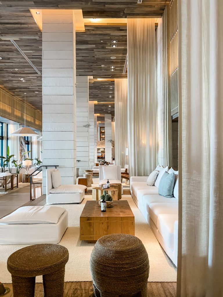
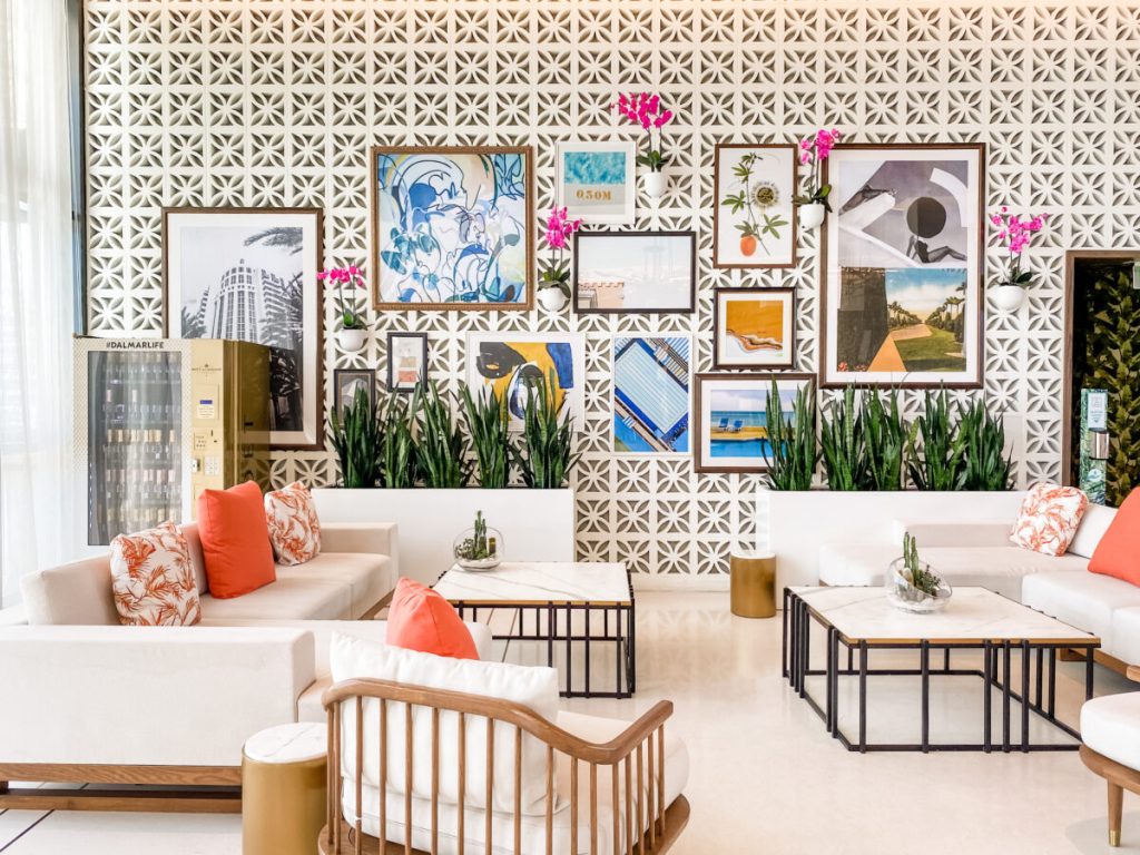
A  Midcentury South Florida Lifestyle Hotel


I felt as if I was transported into a Slim Aarons photo at The Dalmar complete with midcentury breeze blocks, references from both Florida and California during the Golden Age of Travel, and of course, a champagne vending machine giving me these vibes….

The Dalmar, Ft Lauderdale 1

Getty Images: Leisure and Fashion. Slim Aarons, 1961


Several restaurants were closed while we were there due to COVID, but I wanted to share what was open and the spectacular design details, so you can add it to your Ft Lauderdale list.

Lobby and check-in

The open, lattice work work behind the check-in mimics a large scale breeze block pattern tying it to the adjoining lobby bar and seating area. The gold linework detail in the terrazzo and mother of pearl floor creates runway affect, which subconsciously adds to the wayfinding, drawing you to the desk. It also helps define the two seating areas on either side and adds another beautiful, subtle material to the mix. Check out this muted teal slab wall, and they lined the seam up with the doors. So beautiful.

Lobby Bar

This material nesting we see on the corner edge, built up countertop with contrasting piping, and the lowered server station make this an outstanding bar design. This material looks like it might be an onyx and a view of the front (without barstools) shows downlight washing a beautiful book matching of the material. Lovely details.


Lobby Bar Seating

An excellent, one-size-does-not-fit-all, approach was taken here, as we see multiple seating options for varying types of bodies, sizes, functions, and needs. An array of conversational areas and communal tables means creating social areas for people to meet or smaller tables for private discussions. An overall orange and blue (and shades of a minty teal) guides the palette, rich woods warm up the space, white breeze blocks take us back to a specific era, and a casual collection of images creates a sense of place and sparks memory.


Rose’s Coffee Bar

One the ground floor as you enter, this outdoor space off the coffee bar with geometric tile and living wall feel like a garden in the middle of the city. Perfect spot for coffee with a little buffer from street noise. Love the coffee bar lighting, too.


When I share a blog, I consider three readers: The person who knows nothing about design but is interested in beautiful spaces, places and travel. My fellow designers, to show ideas and how other designers have treated each space and situation, and lastly the potential future client who reads this to educate themselves, because maybe, they are thinking about a project of their own someday. I tell you this because you might fit into one of these categories, and while the next pictures may be of little interest to you, they might be for someone else in this group.


Transition spaces

While these seem unimportant, corridors, vestibules and other transition spaces support the experience. I find in some projects, clients want to spend less on these spaces, and I understand that, but these spaces are important to continue the vibe. They also receive a lot of abuse with high traffic and things like careless people in a rush or weary travelers with suitcases. The vertical, stack bond, blue tile is like a gorgeous ocean blue in varying shades highlighted by indirect lighting originating from the ceiling cloud above and uplighting from the floor. Lighting is absolutely everything for mood. Don’t skimp on it. These 3-diminesional tiles in the second photo add a graphic detail and play tricks on the eyes making you question if they are in fact 2-D or 3-D. I love tactile materials that begged to be touched, and a mirror in a vestibule at a hotel is a necessity. We need one last look before we dash out.


Although I couldn’t get great shots of the rooftop pool overlooking downtown, I wanted to share these two images from their Instagram page. And because I have this little obsession with carts.

Oh, and that vending machine I mentioned. We all love full service, but sometimes grab and go is just easier when we want a little more speed and less interaction with folks.

The Dalmar, Ft Lauderdale 22


Hope you loved this destination!! Looking forward to everything being back open!

XO,

Cassandra


1 Hotel Miami Beach

Material Matters

I have been wanting to share the interior of this hotel since we returned last month. If you were to ask me what my style is, this would be it. I’m becoming more and more minimal as I age and have decided I need less and less around me to make me happy.

1 Hotel Miami Beach 23


I always enjoy it when people go to my website and see the projects I have worked on and say, “I see you really like color.” For me, that means I’m doing my job. My projects are a reflection of my client’s homes and businesses, design aesthetics, tastes, styles, colors, products, and demographic we are trying to capture. Not mine. Working with clients gives me the opportunity to explore a variety of design aesthetics, color and styles different from my own personal tastes. I like to say,” I love coloring with all the crayons in the box, but I want to come home to something visually quiet.” This hotel is the silence and texture I crave.

Designed with eco-friendly principles in mind, the hotel is LEED certified and built with reclaimed materials throughout. Both the hotel and operations are designed and run on the best sustainability practices by focusing on environmental impact, recycled building materials, local food sourcing, and things like water and air filtration systems. Even the hangers are made from 100% post consumer recycled materials. This philosophy touches every detail in the hotel like no plastic keys to enter your room and all natural bath products. They even use recycled chalkboards in the room for notes and doodles to cut down on paper waste.

Not only is the mindful approach practiced in the the physical nature of the building and daily practices of sustainability, but also in the spiritual. The hotel hosts full moon celebrations every month to celebrate the changing of the tides, cosmos and energy with the rise of the full moon, as well as, once a month observing something called Dark Sky. That evening, they dim the lights in the lobby and illuminate the area with candles to raise awareness of global brightening and consumption. Reminds me of Bali’s full moon celebrations and day of silence and darkness offering respect to our planet.

The colorless interior, white upholstery, organic and textural materials, concrete, stone, and wood provide visual silence and a place to rest the busy mind. One of the other spectacular things about this hotel is the lighting.

Little nooks and niches for chatting in hotels are a favorite of mine. It allows us to somewhat hide out yet still be somewhat in the middle of things. You get to decide who you want to chat with and how social you want to be. These are spaces that allow us opportunities to chat with those passing by but also discourages them from chatting with us, if we don’t want them to. Often people respect those in a niche or off by themselves, as if they are having a private, not-to-be-disturbed conversation. For me, it’s a non-committal space in a public environment, meaning, I can be around the action and hear the buzz of the lobby and see people, but not be forced into a social setting, if I choose not to be. Sometimes we just want to be a spectator and not a participant. Maybe we’ll be a participant the next night. 😉

The restaurant was closed while we were there, which wasn’t a bad thing for these photos. 😉 Notice all the lighting in the shelves, the cocktail tables, and that custom light fixture over the bar. Can’t wait to go back during the Dark Sky night and have dinner and drinks here by candlelight.

Little details everywhere: barnacles growing on the corners of walls, the heart shape engraved in the door, the weathered wood halls and doors to the rooms, candles and branches everywhere, and the entry to the gym which is incredible itself. As both a residential and commercial designer, it’s always interesting to see how other designers try to conceal or divert the eye away from mechanicals in commercial interiors. *rolls eyes* They are a necessary evil in our projects and seeing how they visually blocked them here with the candles and branches, yet kept it open for proper air flow, is probably something no one else would have noticed but another commercial designer.

The art installations on site also raise awareness and conversation about the philosophy the hotel carries and highlights what we are doing to our planet. These are all recycled items from the ocean. Recycled tv and computer monitors depict animals living inside, as if one day, that might be the only way we will see and remember some of them, because of the destruction we have caused. If it weren’t so sad, this whale might actually be beautiful. A closer look shows the random trash that went into making it. We must do better.

So I don’t leave you on a sad note, I’ll leave you with the best part, the roof!!! Aren’t these cabanas are glorious??

Hope you enjoyed it!! Have you stayed at a 1 Hotel before? Now I have to put the others on my list.

XO,

Cassandra


Design Destination ~The Eliza Jane, Nola

Not Too Pretty | Not Too Gritty

Design lovers headed to New Orleans have to make a stop at newly opened The Eliza Jane. Easily one of my new favorites. Located away from Bourbon St. in the Central Business District, for those who prefer a little something other than that scene, yet it’s still walking distance to the French Quarter. The hotel takes up several historic renovated warehouses and occupies what was previously Gulf Baking Soda, Paychaud Bitters Factory, and The Daily Picayune, and takes its namesake from the previous publisher of the newspaper, Eliza Jane. Jane was the country’s first female publisher, turning a small newspaper into a nationally recognized one. Next door you’ll find this old architectural treasure sharing similar round details on the columns as the the hotel itself but remains as just a facade today.

Original historic details were preserved when possible, exposing and restoring much of the brick archways and metal structural components, while opening up the multiple, adjacent warehouse spaces as much as possible. Upon arrival guests are greeted with red doors, mosaic tile floors and an original fireplace that remains behind the front desk painted the perfect blue with a calming seafoam color on the walls.

Read More

Holiday Travels 2019

Christmastime in The Crescent City and The Conch Republic

There is nothing more I love than hotels and traveling around Christmastime. I love hotel Christmas decorations, because they usually have larger floral and decorative budgets than any of us, along with a full staff to make Christmas magic truly something special.  I love huge Christmas buffets (because who doesn’t like options), formal Christmas dinners, and special Christmas treats that trained pastry chefs take years learning to perfect. I love the sound of a piano playing Christmas music in the marble lobby of a grand hotel with a tree three times what I can fit in my house and hotels with the most memorable Christmas traditions, as you’ll see below. It reminds me of the little girl inside me who remembers going to the mall as a child and thinking how big and beautiful all the decorations were and wishing we could have that at home.

This year we spent Christmastime in New Orleans, St Pete (more on that in a different post) and Key West.  If you’ve always done the traditional thing at Christmas, I hope these images and places inspire you to try something different for Christmas in 2020, like take a trip with your family during the holidays, to create new memories and experiences. One day, I hope to visit some of the world’s most well-known Christmas markets. I’m just trying to figure out how I’m going to survive the cold to get there. 😉

New Orleans, AKA The Crescent City

Roosevelt Hotel

So for the grandest of places, the Roosevelt ranks high on the list, and their beautiful trees and florals do not disappoint. The lighting of their decorations is almost as historic as the building itself and draws people annually to the event.

The interior lobby without the decorations is still nothing short of fabulous. The ceiling, moulding, mosaics, and lighting are a course of study in interior design alone. After a closing due to hurricane Katrina and reopening in 2009, the carpet that had previously covered the lobby was removed, everything was restored, and everything brought back to its original grandeur. I’ll save more of the details of that for a design details focused blog post later, but because I can’t resist, here are a few.

The Ritz Carlton

Another grand favorite going over the top is the Ritz. Their gingerbread display is probably the best I’ve seen so far, which includes a streetcar and a tugboat. The tugboat is a new addition this year and both are all made from gingerbread. A work of culinary art indeed and truly a labor of love. If you’ve ever built one from a kit, you know the amount of patience they take.


Step right outside the Ritz for these windows. Who doesn’t love a beautiful Christmas window to inspire child-like wonder?

The Hotel Monteleone

The Monteleone is always a must, especially if you’ve never seen the Carousel Bar. They also offer a Reveillion dinners throughout the month of December. Don’t know about this New Orleans tradition? Click here for an explanation.

The Royal Sonesta

This is probably one of the most photographed street corners in New Orleans, thanks to their quintessential New Orleans style architecture, iron balconies and their showstopping hanging planters. It’s a corner I often see used in tourism promotional photos. Pop in for a coffee at PJ’s and walk through their hall of trees. Oh, and here is their balcony with ferns, sweet potato vine and fig vine just pouring out of their planters.

Key West AKA The Conch Republic

Old Town

Mid-December we headed to Key West for the remainder of the year. The entire town was decorated, so I didn’t feel like I missed out on not having a tree or decorations this year. This little conch cottage is so classic Key West Christmas and who doesn’t love lighted palm trees? The lighted chicken is absolutely perfect considering the amount of gypsy chickens roaming the town. The big Victorian house did a blue, snowy theme with giant snowflakes hanging, and makes my favorite list just for carrying a concept throughout.  They did an outstanding job on it. The city must have a Christmas light competition, because we saw signs in yards saying, “vote for this house.” The tree below at the marina was all buoys and the lighted boats were always fun to see from shore.

America 2.0 Schooner

We sailed on an classic schooner for brunch on Christmas Day and saw Santa boarding his yacht for vacation after making all his deliveries. Haha. Just kidding. I’m sure he was paying the very lucky kids on board a visit to hand deliver their gifts.

This sweet little bakery, just a block away from our rental, was absolutely adorable and yummy, so we were there frequently. I think my husband walked there every single day for coffee, even if we didn’t get food from there. My favorite shop in Key West, Grace on Frances, did an all minimal, organic theme with their decorations, which I love. They used a Mexican straw garland seen above the windows, which I had to buy, and natural ornaments on their tree. I have blogged about them before and tell people all the time, you have to get off Duval St. for some of the best places in Key West.

And when you live on a tiny island with quirky houses, eclectic people, and chickens running loose, your mode of transportation should be anything but ordinary. This Moke wins my heart.

Hope you enjoyed reading and if you’ve never traveled during the holidays, I hope you’ll consider it this year.

Xo,

Cass

1960s Ranch Kitchen

This 1960s ranch had low ceilings, limited light, and a poorly designed, inefficient floor plan.

Space planning:

The main problem with the design of this kitchen was the peninsula. Peninsula kitchens almost always make a kitchen smaller, and I only use this design configuration as a last resort. In this scenario, the peninsula and raised bar (a thing of the past), cut the kitchen off physically and visually from the breakfast room, limited contiguous countertop space, and in the below pictures you can see how it’s dividing the room in half.

Several other problems existed:

  1. Bar seating wasn’t possible due to the limited space on the breakfast room side and conflicted with the breakfast room chairs, making the bar useless anyway.
  2. The refrigerator was too far out of the work triangle guidelines for kitchen design, making it very inefficient and creating more steps than necessary.
  3. The refrigerator was on the other side of the entry, crossing the circulation path from the laundry room, powder room, and garage studio/workshop.
  4. The wall next to the refrigerator further fragmented this section from the kitchen as a whole.

 Design is not just trying to make spaces beautiful that are Pinterest or Instgram-worthy. Design is about making them more solution-oriented, so life is life easier, and one of those ways is by eliminating problem areas in the built environment.

Read More

Jekyll Island Club

Slow Living

Just recently we returned from a lovely week at the Jekyll Island Club on the coast of Georgia. Not our first time, but each time I am struck. It is a course of study in architecture, design and fine living. Such an easy getaway from Atlanta, and it’s as if time slows at the Jekyll Club – a place where croquet is played on the front lawn, porches overlook the gardens and beautiful historic trees, and architectural masterpieces line the street to the Jekyll Island Club Resort – a once seasonal destination for the wealthiest people in the world.

Read More

House of Lu Restaurant Project Published in CODAMagazine

CODAMagazine Tranformative Walls

It has been a crazy, busy couple of years. Blogging is one of those things that is always in the back of my mind but seems to get lost in the daily tasks, repeatedly. This year already, I have finalized House of Lu, the Chinese/Vietnamese restaurant I’ve been working on for over a year, started a neighborhood, and just came off a life-changing journey in Thailand. There is so much to write about, and while I was in Southeast Asia, I promised myself to spend more time here blogging.

As I’m working on my blogs for Thailand and gathering pictures, I thought I’d share an exciting little piece about House of Lu I received while in Thailand. CODA (Collaboration of Design and Art) Magazine published my project in their Transformative Walls issue. This issue is about “reinventing the wall: design + art projects that cover, adorn, and construct the walls that make up our built habitats.” It’s so rewarding to see your work alongside projects featured all over the world in places like Japan, Germany, Canada and more.

This issue specifically focuses on the walls (murals) and the relationship the art had to this project. Myself and clients Cindy Lu Tam and Johnny Tam worked closely with artist Marc Noreikas to develop the concept for both walls. My client was extremely thorough and specific in her desires for the project, and we spent many months researching, designing, redesigning and taking field trips to many restaurants in the Atlanta area. We created Pinterest boards for every aspect of the project, (including the murals), saved ideas from magazines in binders, and looked at restaurants and hotels all over the world. Having clients that love design meant they came to the project with magazines and a binder of clippings they had been saving. Designers love that. It helps us know what a client is thinking.

Previously only a Chinese restaurant, my client’s family owned business had already been in operation for 17 years. After the renovation was complete, my client wanted to reopen with Vietnamese cuisine, in addition to their longstanding successful Chinese menu, in order to reflect both of their family’s cultural heritages. We knew then, one mural would represent their Chinese heritage and the other would represent their Vietnamese heritage.

From the beginning, my goal for this project was to be sure we used cultural images, but in a new and exciting way. How many times have you been in a Chinese restaurant and seen dragons, jade, lanterns etc? It alway looks so tired and uninteresting. I wanted to represent the culture but in a bold, captivating way. Having worked with Marc Noreikas previously, we both really liked his graffiti style and thought large, bright murals could give it the edge it needed. We knew he could convey the energetic, graphic feel we were trying to achieve, while maintaining a softer more elegant look to elevate the dining experience without being too harsh and reminiscent street style graffiti.

The first mural we decided on was the dragon mural. Dragons are common in Chinese motifs, and Cindy found a dragon she fell in love with instantly and had been holding on it to for quite some time. In fact, initially, she wanted to see if the Historic Board of Review would allow it on the outside of the building in the historic downtown area. The second mural was the Vietnamese lady. The girl with the hat and boats in Halong Bay in the background were prefect to represent Vietnamese culture. We worked hours and hours compiling motifs and images for the murals, reviewing the edits Marc made, and continued to have him recreate the preliminary sketches. I thought he was going to fire us as clients. 😉 He was patient and helped guide us to and away from certain ideas that may not work on such a large scale and both murals came out fantastic. Scroll down about half way to see the project. Huge thanks to CODA for including us in this issue.

https://flipboard.com/@codaworx/codamagazine%3A-transformative-walls-it6a307oy

It took him about a week to paint each one, working nights after the restaurant closed. I’ve included some of his WIP (work in progress) pics below, because I know those are always fun to see. For me, preliminary sketches and progress pics of how an idea comes together are more interesting sometimes. It show me how artists work and how they think.

More on the process for House of Lu soon. I can’t wait to share pics and stories about Thailand with you.


xoxo,

Cassandra