Space Planning | Designing the Floor Plan
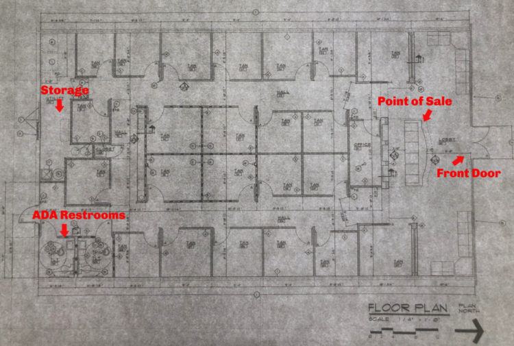
In its last iteration, this space was a Palm Beach Tan chopped into about 25 small rooms for individual tanning beds. There were two ADA compliant restrooms in the back corner of the space and a small storage room running along the back wall, both we knew we wanted to keep. In the case of the storage room, we would need to possibly expand it to accommodate larger items like furniture being temporarily stored. Everything else needed to be gutted.
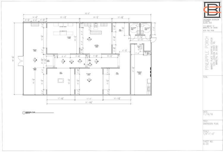
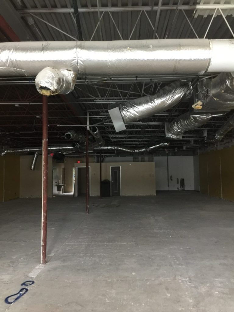
Below is a copy the landlord gave us of the as-built plans from the tanning salon. This was the space we walked into. You can see the individual rooms where the tanning beds were, along with key spaces I’ve notated. The pictures below were taken prior to construction from the front of the store at the point of sale where you paid for your tan. You can see from the plan and pictures, there were two hallways on either side of the point of sale running almost the length of the space that met at the back of the space and created a small back hallway.
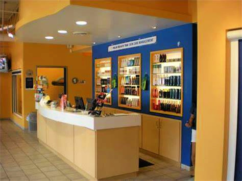
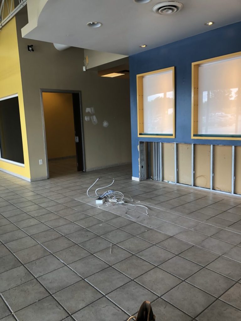
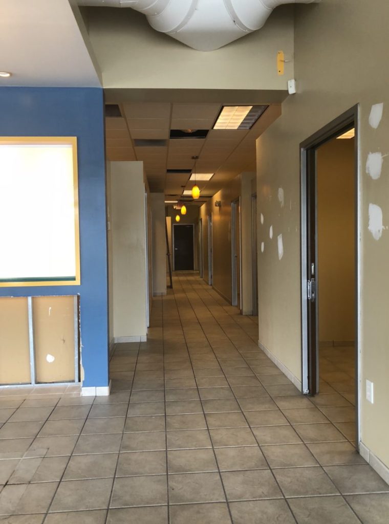
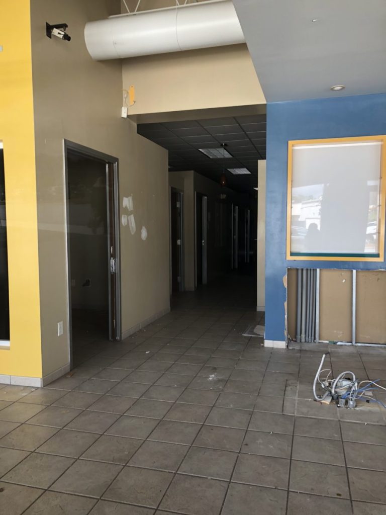
During initial conversations, although they were looking at this space located in a small retail strip, my client mentioned she had always wanted a shop in a freestanding house. That stuck with me throughout our initial conversations and as I began the space planning process. As with all my retail clients, we have many discussions about the overall feel, experience, and functionality of a wide open store, as well as, a store with smaller partitioned off rooms, and how that creates the need for visual control throughout the store for things like theft, customer service, and other retail related functions. Even if the store were to be wide open, due to the size of this store (almost 3,000 sq ft) and the size of displays, furniture, and fixtures, there would always be parts of the store that would be blocked and little corners that would be hard to monitor. We talk about these things constantly and work to find a balance that feels right for the client, for the items they’re selling, the number of employees they’ll have on the floor to service and monitor customers, and many other factors. Ultimately, there isn’t one perfect solution but rather many- like installing cameras, placing more expensive items up front near the register or in locked cabinets, and keeping the smallest items in plain view. Unfortunately, every store experiences theft, and we do the best we can to mitigate it.
As with any project, I use a client-guided approach and feel each client deserves to have an interior that represent them and what they want to say. Many design firms have a look that defines the firm’s brand, but I feel the project should showcase the client’s brand and taste, so we begin with their general likes and dislikes. Among other things, this client told me she loved traditional design, French country style, and the color blue was her brand color. I have clients give me as much detail as they can about what they love (and even what they don’t love, so we know what to stay away from). We look at photos together, share a Pinterest board, go on field trips if they have time, and I have them write down or tear out magazine photos of what they are drawn to, so I can get an idea of who they are and where we should start. This helps me narrow down what we are trying to say visually. We look at the lines and products they’ll be carrying, so we can create an interior that supports those items visually. In commercial design, we have many discussions about personal taste vs the taste of the consumer, the demographic, the location, how people shop and move about a space, and what will sell in the area. Casting a wide net for a variety of shoppers, while remaining in brand, is what we focus on.
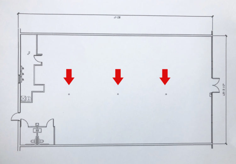
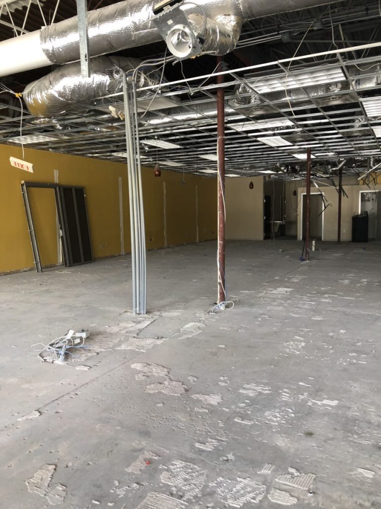
Below is a copy of the plan the landlord gave us. This is basically the shell of the space and what we would be working with once we demolished all the rooms, keeping the restrooms and storage. You’ll see how we straightened out the line of the storage room and expanded it by pulling it out in line with the restroom wall. The first concern for every interior designer when beginning designing the plan is the structural columns holding up these buildings. They are almost always in the way or located in the worst spot, and we spend a great deal of time figuring out how to incorporate them into the future design by hiding them in a wall or closet, working around them, making sure they aren’t in the center of a room or circulation path, cladding them in material that looks purposeful and not just to cover it up, and basically preventing them from looking like what they are -posts in the center of the space holding the building up. As you can see once cleared out, there were three in this space, and although they were just slightly offset of the center of the front door, they were practically in the middle of the space. Whatever the floor plan was going to be, walls or other design elements needed to anchor to these points, and hopefully, if at all possible, consume them completely so occupants would never see or notice them, and employees and customers wouldn’t have to work around them on a daily basis. The ceiling and mechanical system was a complete disaster. With four units and what seemed like miles of ductwork running everywhere (previously needed to cool a tanning salon), cleaning that mess up and deciding how to hide, eliminate or focus the eye away from new ducts was definitely a monumental task in this space.
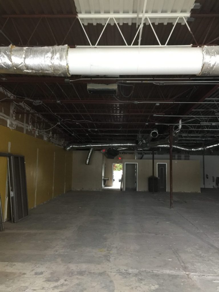
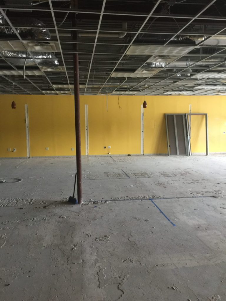
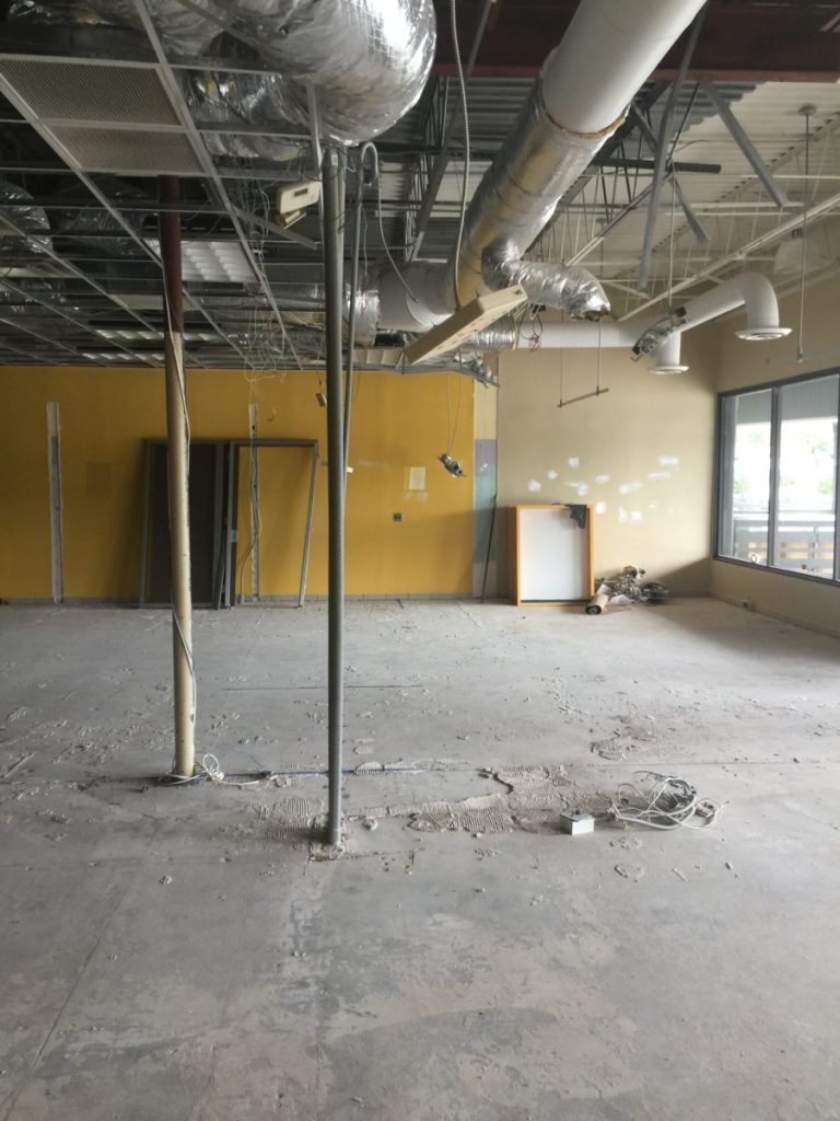
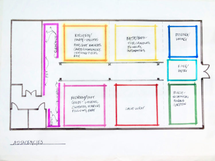
Holding on to the thought that she always had her heart set on a freestanding house, I decided we would design the store to look like a house. This solution made perfect sense, since the store was all about Southern hospitality and gracious living and entertaining. We worked through the spatial adjaciences to categorize the items to be sold into “rooms” that might make sense if it were a house and possibly flow from the front to the back of the store. Each space would be loosely designated as a room in a house: kitchen, living room, dining room, bathroom, main hall and a foyer at the front to allow for transitioning into the interior space, further supporting the idea that you’re in a residential-like environment. Initially, the client thought she might sell bedding but later decided against it, so we named the “bedroom” the soft goods room for blankets, pillows, throws, etc. The two back rooms would be for a men’s study type room dedicated to offering gift items for men and a baby room for baby gifts. This would also make it easier for her to merchandise which items would go where and create a natural, easily understandable flow around the store for customers. Of course there would be some crossover and items that didn’t have a specific room, but this created a great base to work from. From a customer perspective, it makes it very straightforward. If I’m in a hurry, and know I need a gift item for someone who loves to cook, I can head straight to the “kitchen” room of the store and not have to look all over the place. Below is the first loose conceptual plan I presented with adjacencies for room organization.
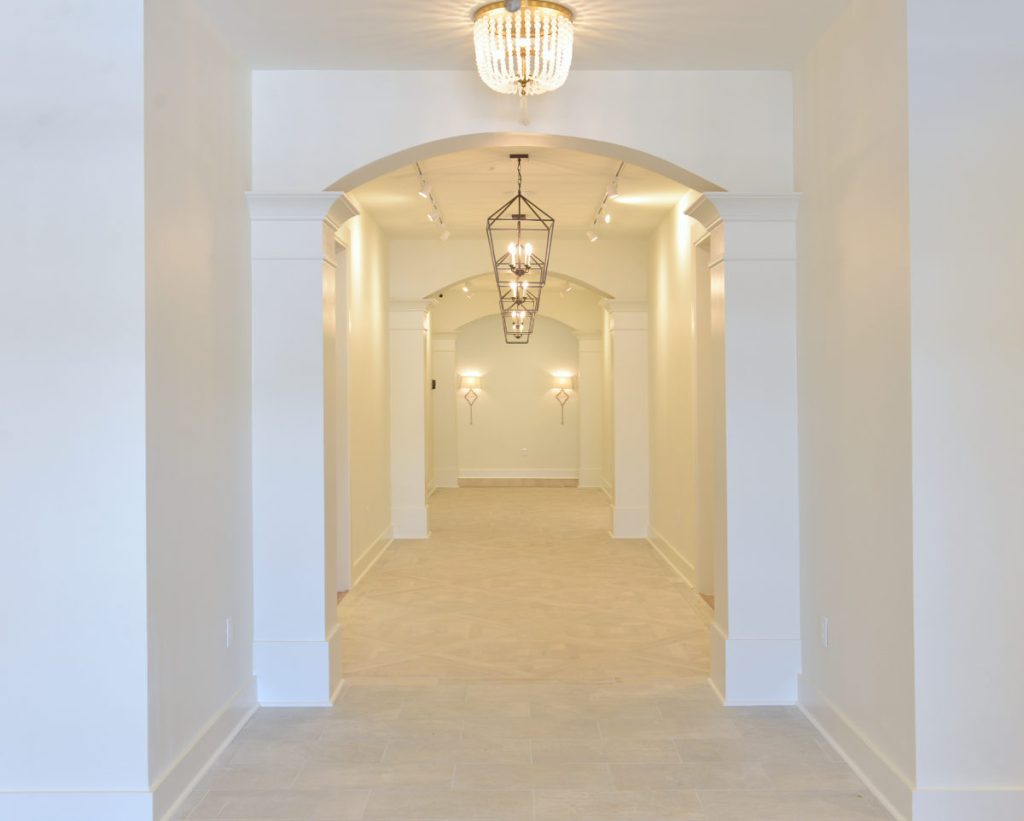
The idea was to create a main hallway that draws you down the center of the store both visually and physically with large rooms off this main hall, like you’re entering a beautiful foyer and hall. I loved the idea of using traditional architectural elements in this space and wanted to create an arcade or loggia to set the tone for a timeless, elegant environment. This would allow me to mimic the columns on the other side of the center line of the door creating the hall, wrap the structural columns with decorative columns and connect them with arches. You can see the beginning phases of that hall and those arches in the above drawing. The three solid black boxes represent the structural columns, and the open white boxes marked with an X directly across from those represent dummy columns that exist purely for decorative purposes to create balance and provide a nearly symmetrical design. The right half of the store is smaller than the left, as the front door is not precisely in the center of the storefront. From the human experience upon entering, this is virtually undetectable. As designers, we have to consider this all the time while designing- at what point will something like this become noticeable in the built environment and offset the balance of a space. After flushing out this plan and massaging some of the rooms based on how much product we had to dedicate to each room, we decided to flip a couple spaces, shrink down some of the rooms, and create larger spaces for the back rooms. Below is the plan now. Keep in mind, the drawing is flipped. The entry is on the left side of the plan with the restrooms and expanded storage room on the right side. You can also see the cased openings to each room, which allow better visibility and circulation, while maintaining valuable wall space for display, yet creating the intimate, cozy environment the client really wanted.
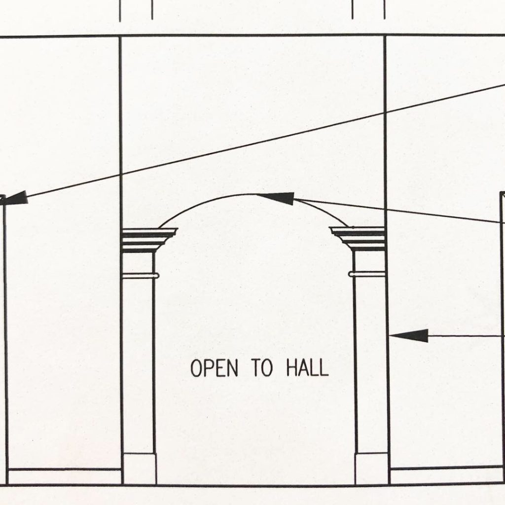
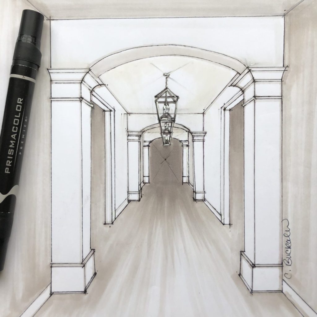
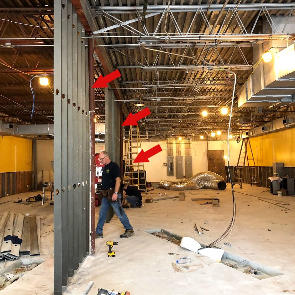
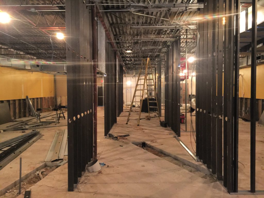
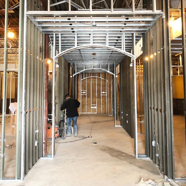
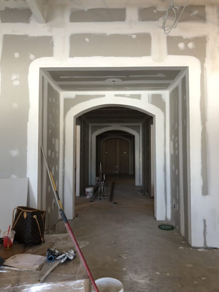
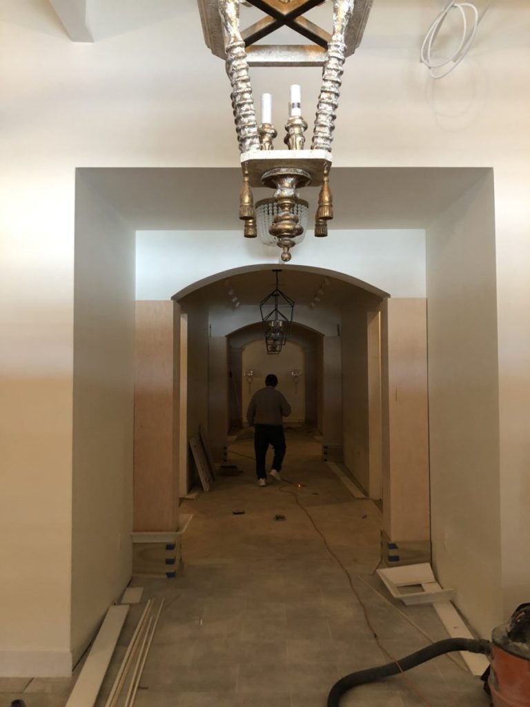
Below is the progression of the design and process of building the hallway and concealing the structural posts within the decorative columns.The first drawing is a small close up shot of one of my elevation drawings in the construction drawing set. The second is a hand rendering I did of what the hallway would look like when completed. In the next photo, you can see the space has been gutted, and the first wall of the left side of the hallway is going in. I’ve drawn arrows to indicate where the structural columns are in that photo and how they interface with the new wall. The next drawings show the drywall going up and the columns being wrapped with the decorative pieces, almost like a bracelet on an arm. The last picture shows the completed hallway with arches and columns. This was a seamless process that required initial coordination between the GC’s crew for framing, dry walling and preparing the structure for the carpenter to add his millwork elements on top. Each drawing and picture below was taken from the same vantage point.
In the next few posts, we’ll take a look at the different rooms within the store and some of the custom displays created specifically for this project. I’ll share some of the code requirements and decorative details, as well.
Thanks for reading!!
XO,
Cass
Project Credits:
Project Design: Cassandra Buckalew Interiors
Project GC: JLT Services
Project Carpentry/Millwork: High Tech Design
