Functionality|Artistry|Creativity|Innovation
Between the classes and the products, it takes a bit to digest everything at Neocon. There is so much to take in, see, do and remember. Below are pictures of installations, tile work, trim details, furniture, rooms, and new trends in design I saw and thought were noteworthy or loved, for one reason or another, in both residential and commercial design.
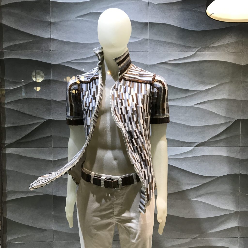
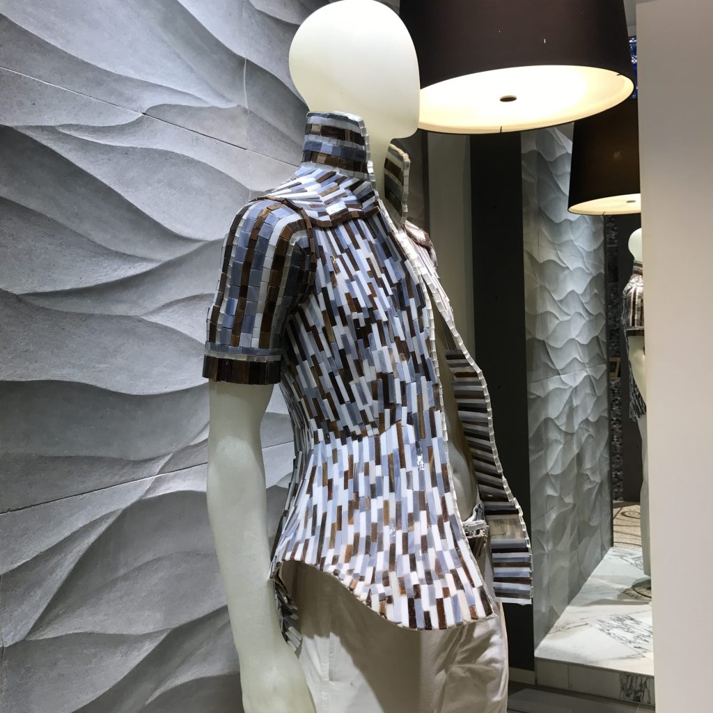
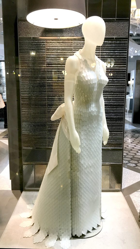
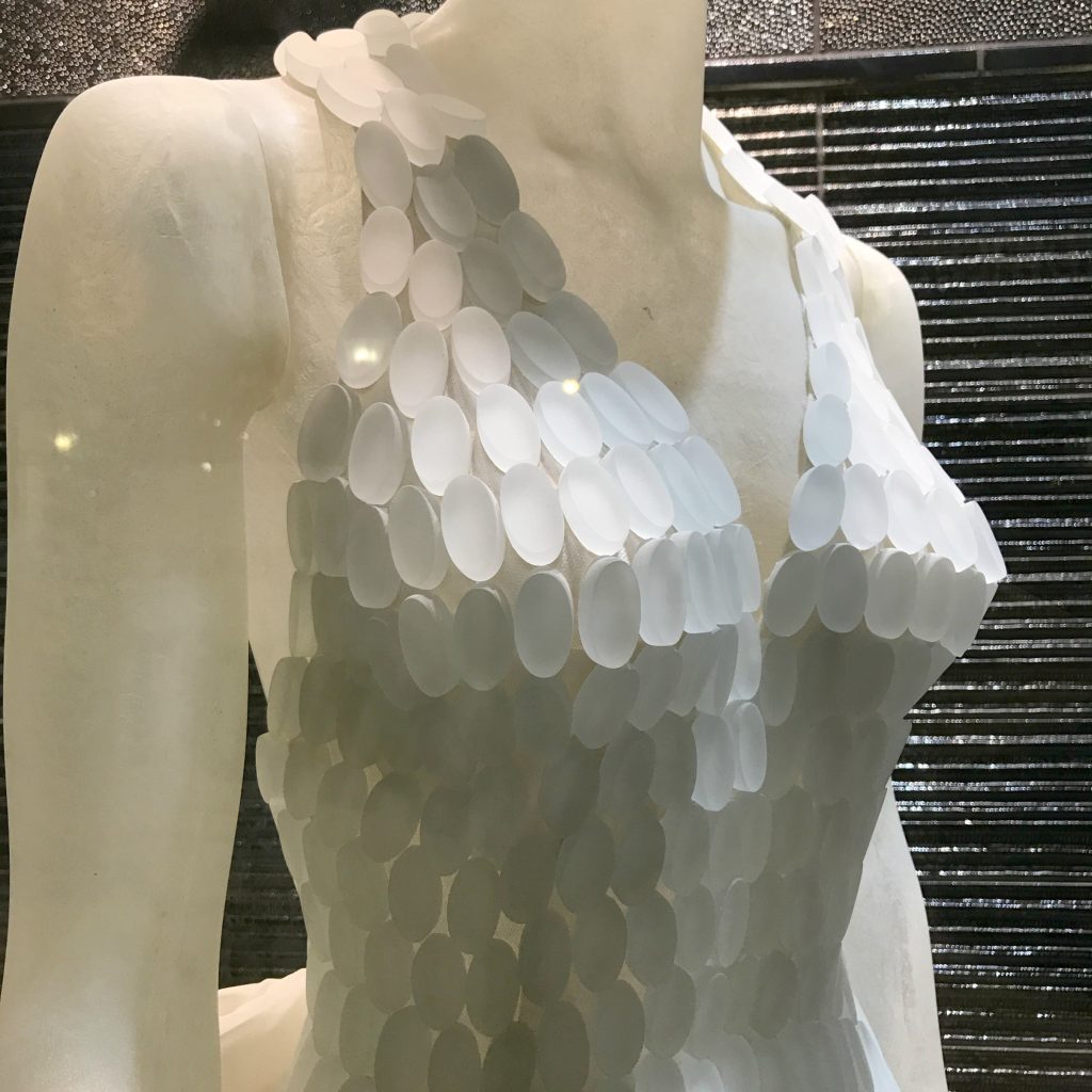
Artistic Tile’s fashion inspired mosaic tile jacket and dress were works of art. I can’t imagine the painstaking process of making that dress and capturing the draping of the fabric around the curves of the body. Mosaics usually come on a mesh material to make it easier to tile in large squares, but these had to take a great deal of both planning and patience.
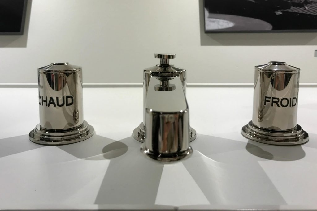
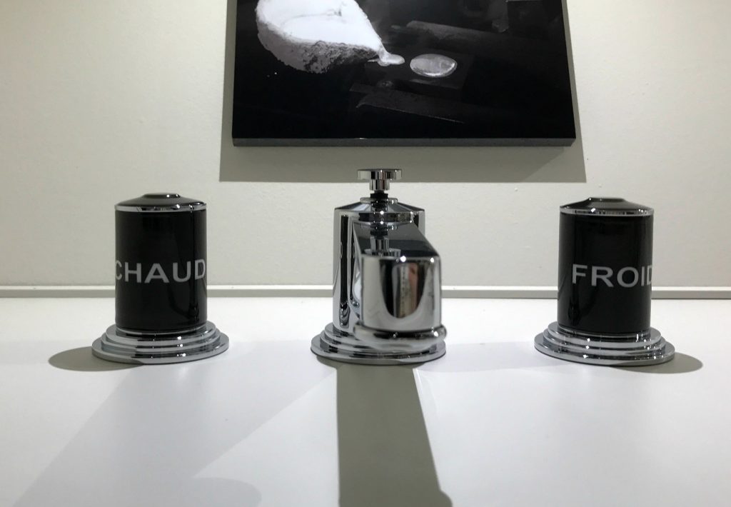
Devon and Devon’s updated version of the hot and cold faucet were my favorite faucets.
Luum Textile’s vertical, suspended, fiber installation was a huge hit and had everyone walking through it, touching it and feeling it. They had several stations set up so you could interact with the fibers, weave a small carpet while you were there, and basically play with their materials. Isn’t that what everything in an interior should be about, the ability to touch, feel and use all of our senses to experience it?
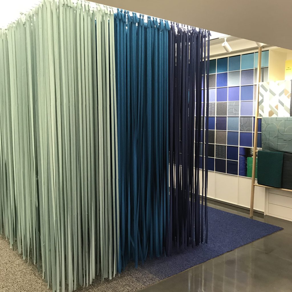
Mannington Commercial‘s back-lit and up-lit, cut and torn paper scene gives me all sorts of ideas, specifically about something wintry for Christmas.


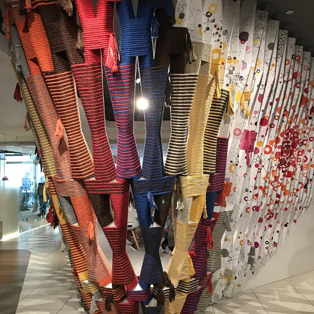
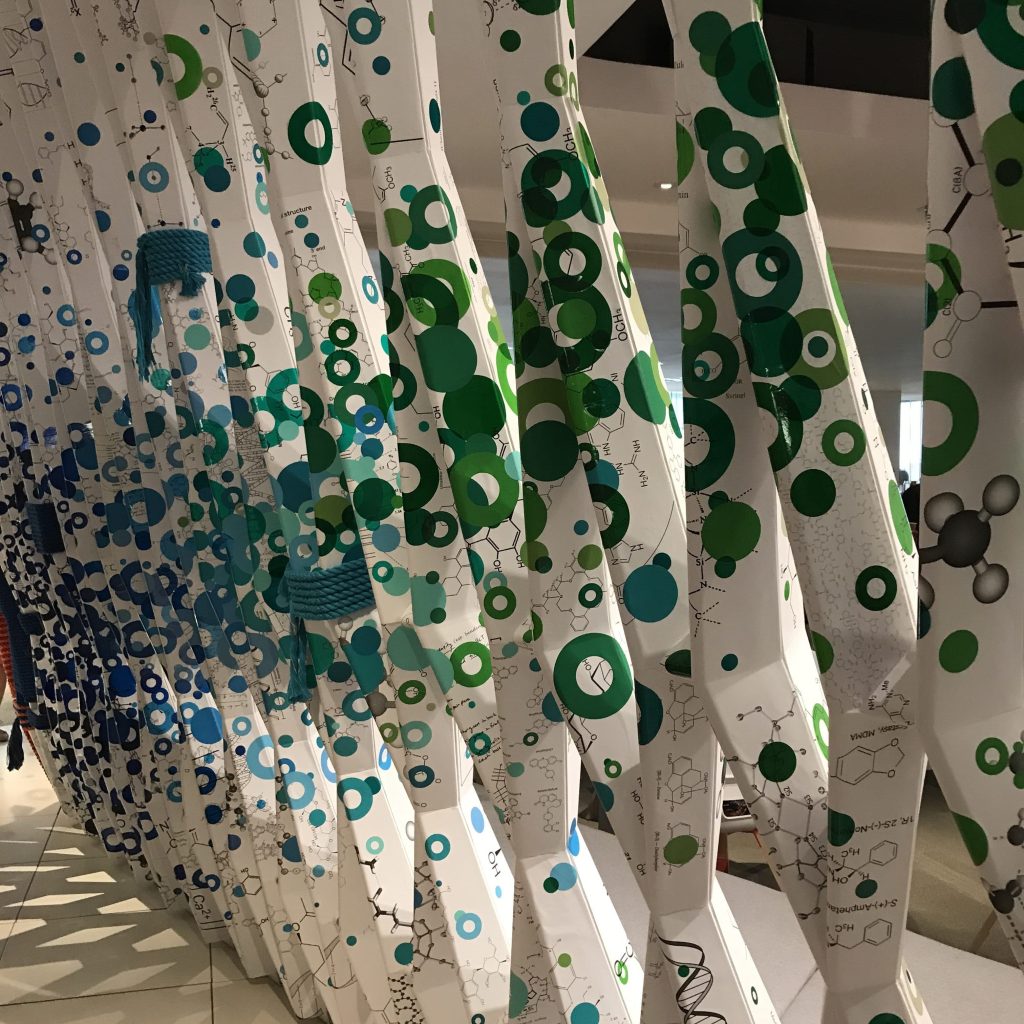
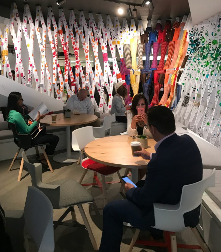
Unfortunately, I don’t recall where this was when I saw it, because after multiple floors, showrooms and booths, you tend to lose track, but I love the idea of creating an art installation as a visual barrier to define and divide space, instead of using walls. This installation was made of rope and what looked to be printed paper with the molecular structure of something. The installation was shaped like a V, and inside the V were tables and chairs which provided an envelope for those wanting to rest and be away from the noisy crowds.
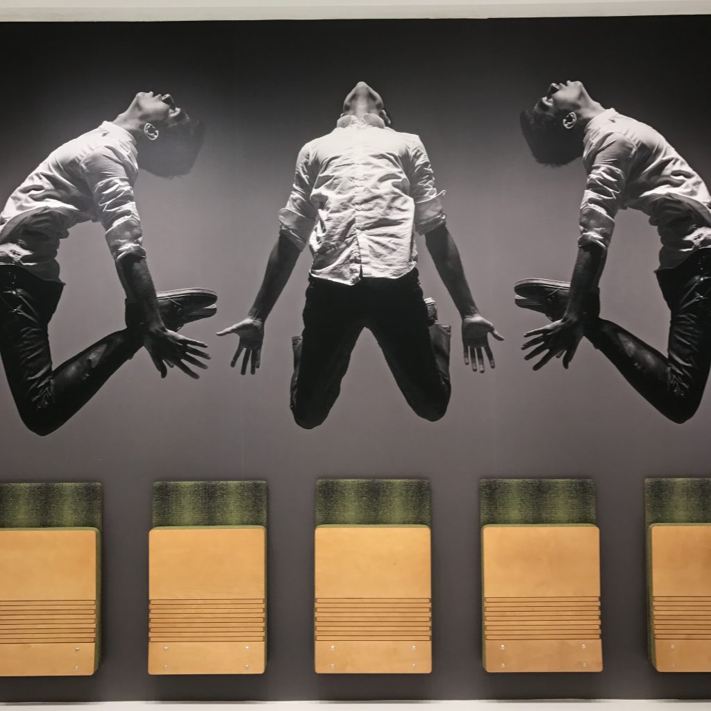
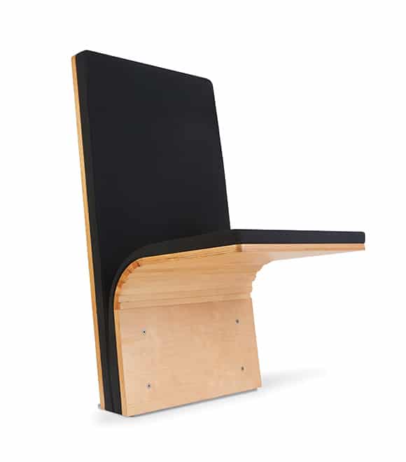
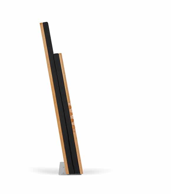
The most innovative product I saw was Sedia Systems’ Jumpseat. This seat is pure genius, can support a full size adult, mounts on the wall or floor and flips up like theater seats when not in use. When folded up, the seat is only 4″ thick, making it the perfect solution for tight spaces. The first picture was their display at Neocon and even their imagery was clever showing a man mid-air as if he was jumping.
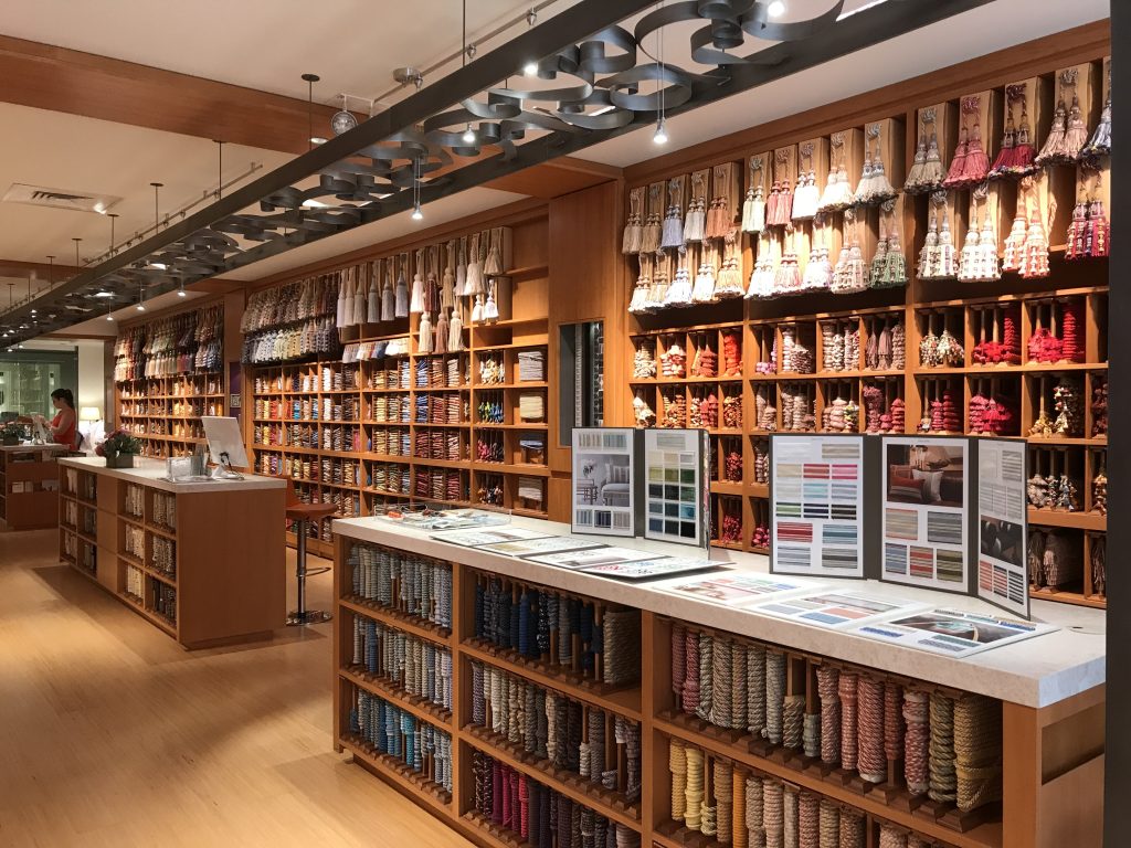
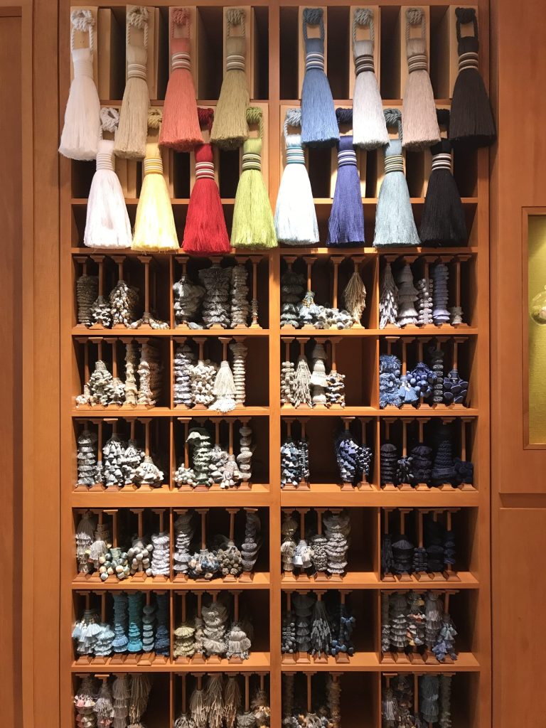
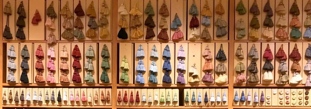
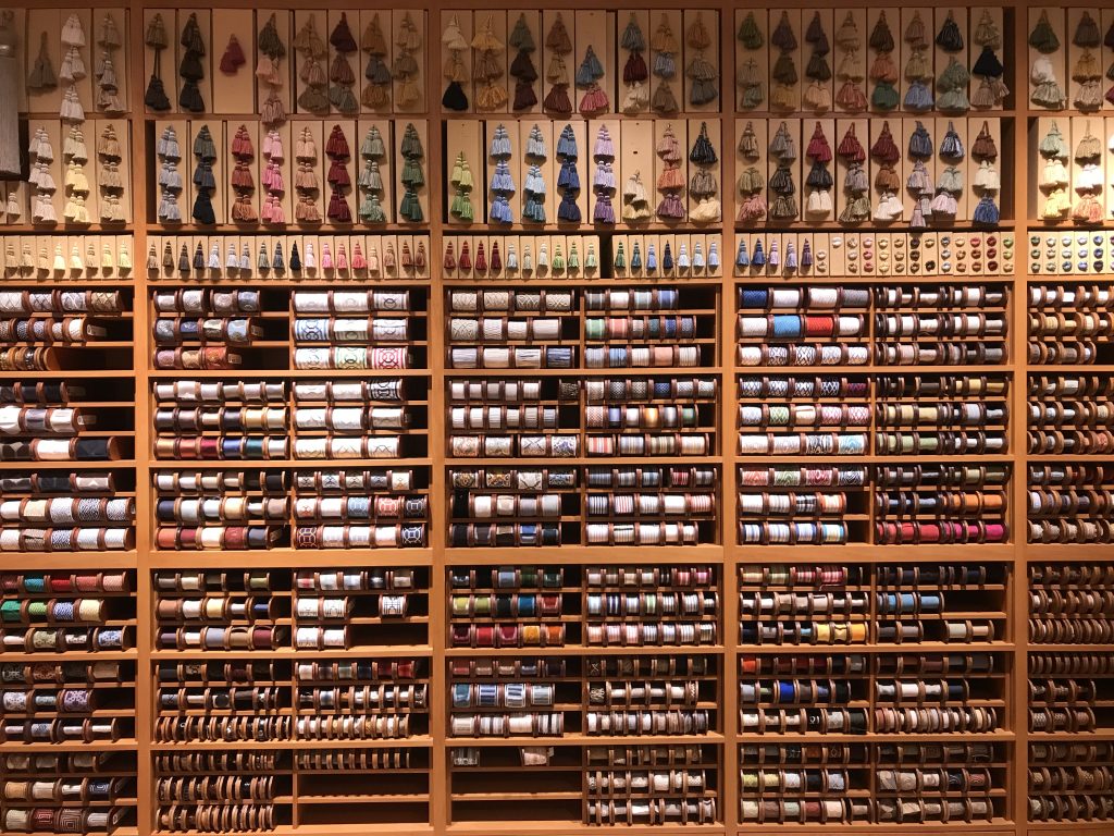
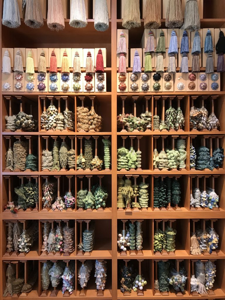
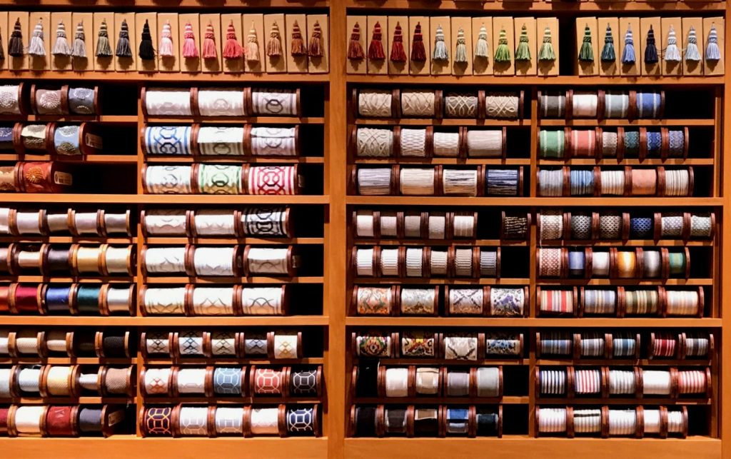
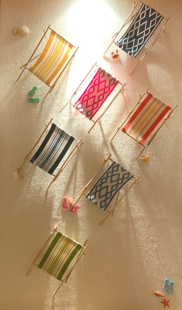
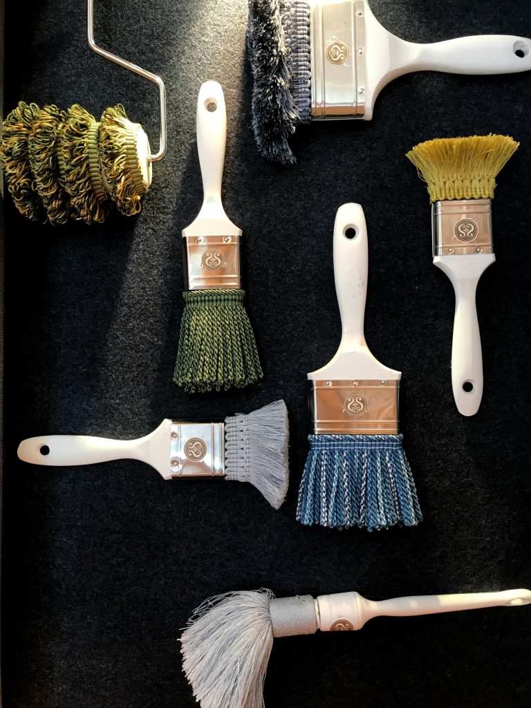
Samuel and Sons’ trim showroom, much like Artistic Tile, went down as my favorite for using their products in non-conventional ways. Although Samuel and Sons is carried here in Atlanta by Ainsworth Noah, there isn’t a showroom dedicated specifically to trim. Samuel and Sons is a passementerie lover’s dream. It was their creative use of fringe trimmings on paint brushes and tape trim to make the fabric for the outdoor sling chairs in their beach display that I loved. Samuel and Sons is a library of every trim imaginable arranged by color and grouped by style, making it easy to find the trim you need.
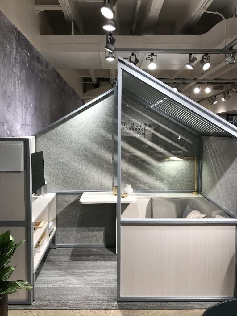
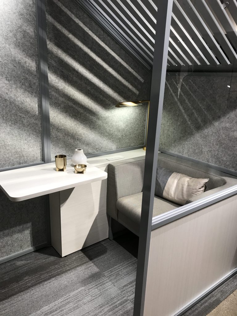
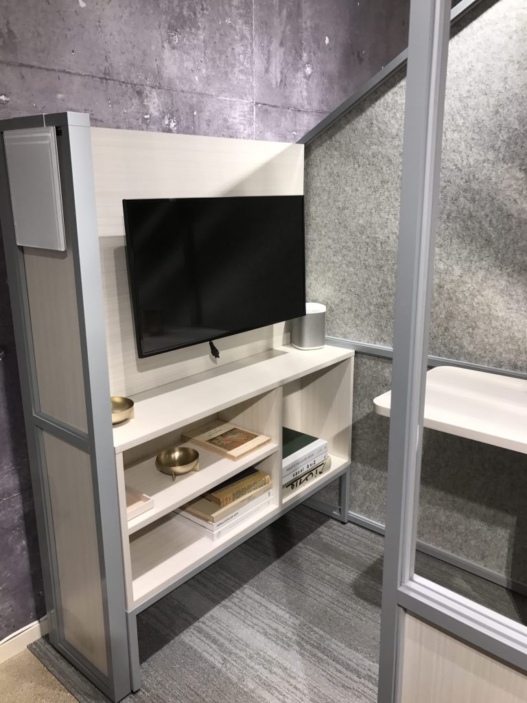
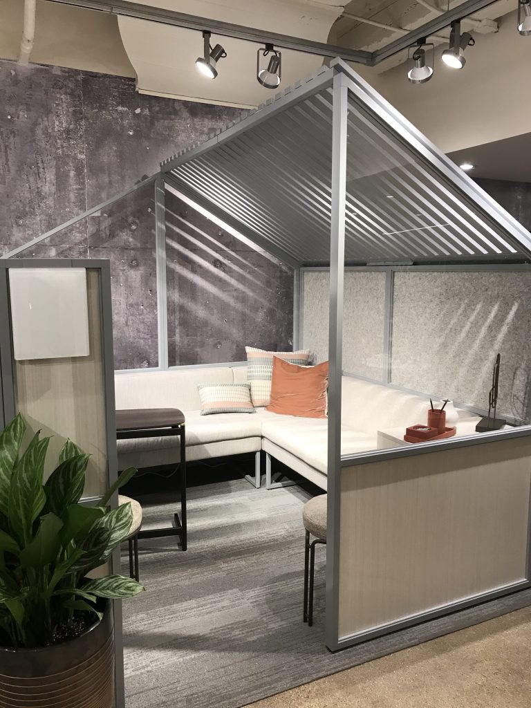
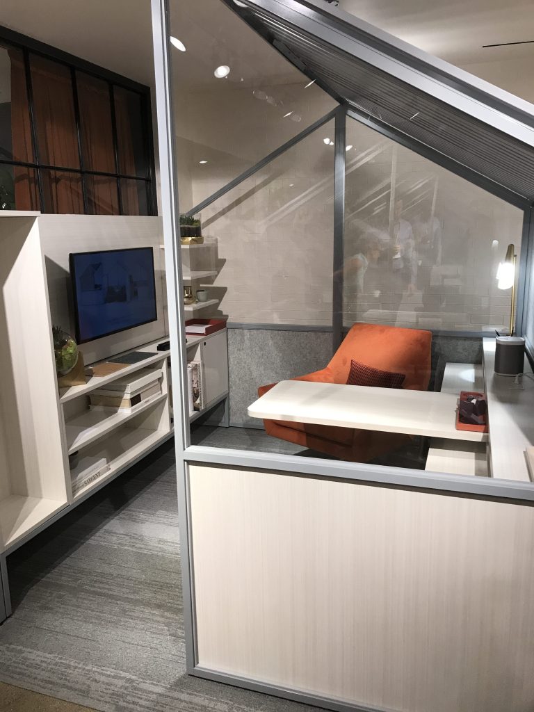
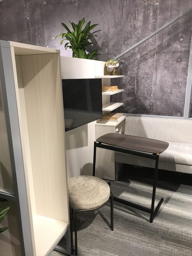
West Elm Workspace won the Best of Neocon Award in three categories, one of which was the furniture systems category. As people are now discovering, the open work environment is actually more prohibitive to working efficiently and productively. Really? I was wondering when that was coming. I’ve never understood the open working environment to begin with because who can concentrate? West Elm has come up with a new way to tackle the privacy issues in the open environment with their Haus concept. Haus is designed for individuals or small groups to work away from the busy, noisy open office without the need for walls, while providing both visual and acoustical privacy in three different configurations. And as you can see, it looks like a tiny house, thus making it seem less like an office and more like a social place for collaboration. I’m so thankful I don’t work in a traditional office setting. If I did, I would need one of these for sure. This is such a great solution for the office without having to put up walls and take them down based on how the team changes, grows and/or diminishes over the years.
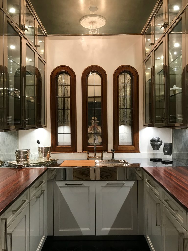
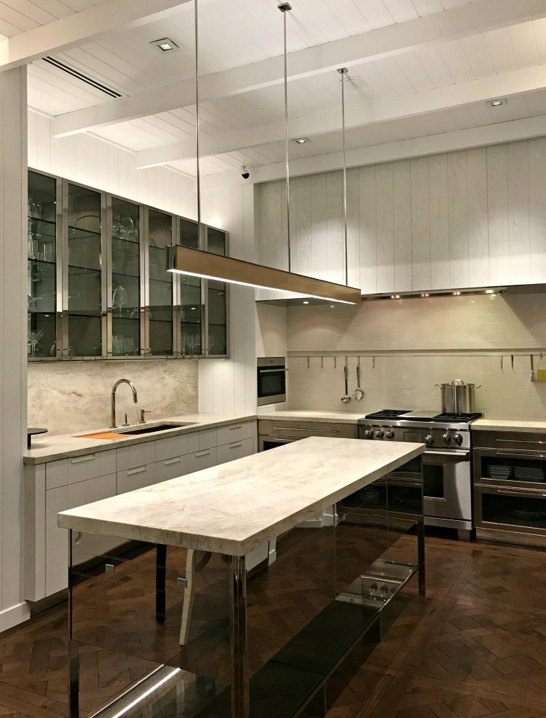
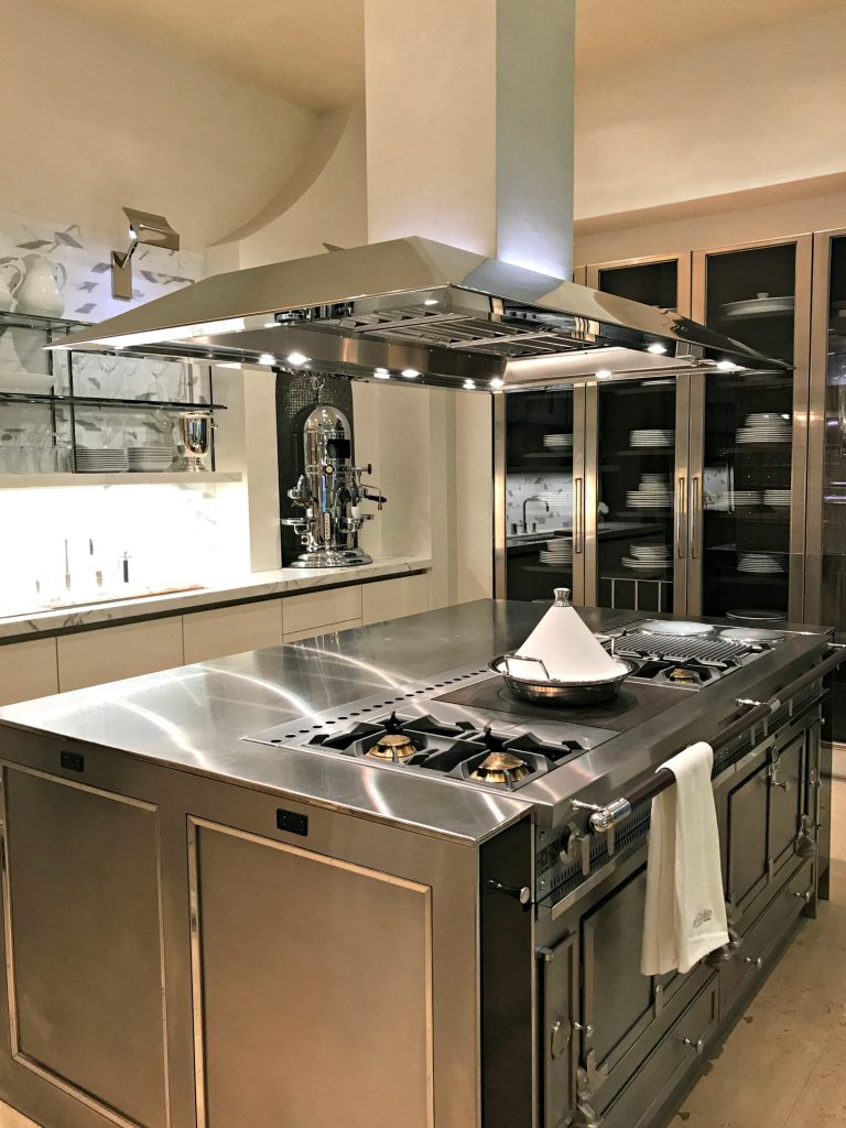
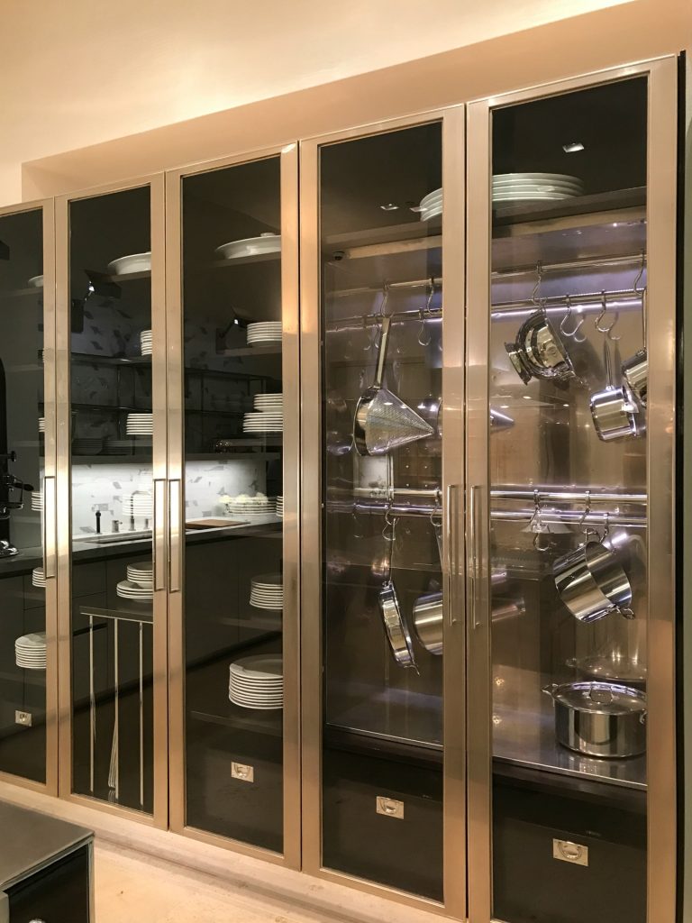
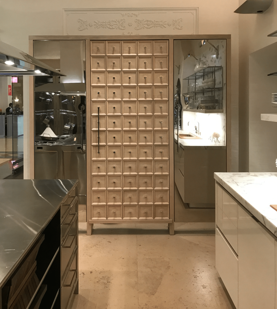
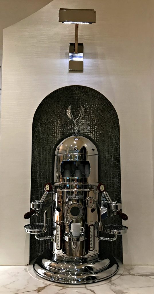
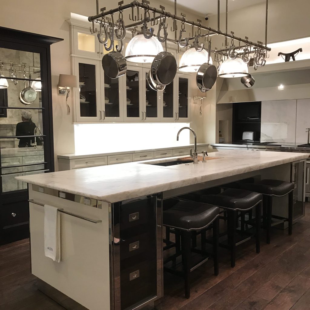
There are some gorgeous kitchen showrooms at The Mart that will make you drool and rethink your current kitchen at least a couple of times. de Giulio is one of them. If these kitchens resemble Siematic at all to you, it’s because Mick de Giulio has designed several of their collections including their New York showroom. There aren’t enough accolades for this man. The finishes are luxurious, and the solutions for problems we face in the kitchen are brilliant. I need that built-in, hanging pot storage. On a side note, have you seen one of these Elektra Italian Espresso Machine? It’s the real deal and definitely deserves it own special task light along with that arched, tiled niche to give it pride of place. I’m pretty sure I recall seeing one in Venice while we were there.
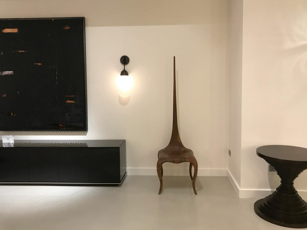
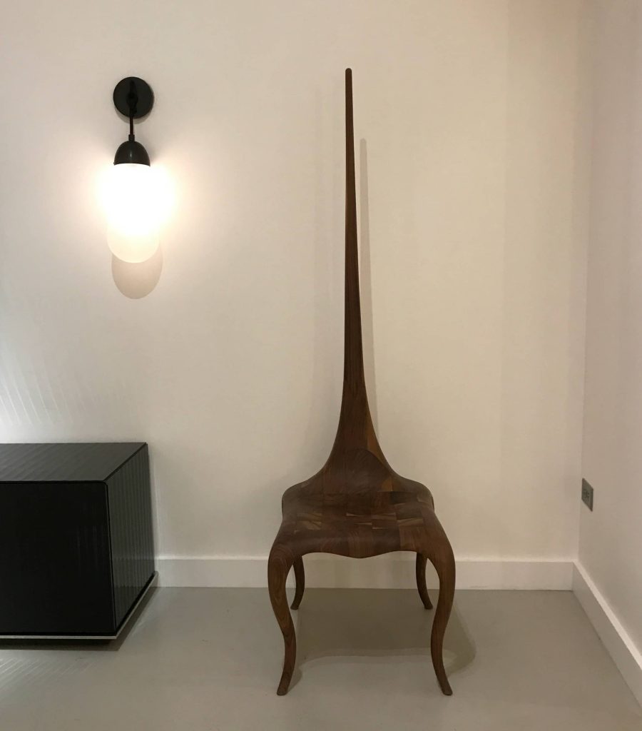
But by far, my single favorite thing at Neocon was Atelier Gary Lee’s Lady Stinger Chair. Highly sculptural and displayed in American walnut matte finish, this chair, with its combination classic, 18th century cabriole legs, bee stinger vertical back, and modern sensibility, is to die for in my book. I have the perfect place in my home for it, too. It nets at $9K, though. Eek!
Whether it’s commercial or residential design, I take inspiration from all aspects of this industry. So often you see a small detail that leads you to something else, or points you down a different path. Exposure to all forms of art, design and creativity inform my work on all levels.
Looking forward to Neocon 2018!
xo,
Cassandra
