CODAMagazine Tranformative Walls
It has been a crazy, busy couple of years. Blogging is one of those things that is always in the back of my mind but seems to get lost in the daily tasks, repeatedly. This year already, I have finalized House of Lu, the Chinese/Vietnamese restaurant I’ve been working on for over a year, started a neighborhood, and just came off a life-changing journey in Thailand. There is so much to write about, and while I was in Southeast Asia, I promised myself to spend more time here blogging.
As I’m working on my blogs for Thailand and gathering pictures, I thought I’d share an exciting little piece about House of Lu I received while in Thailand. CODA (Collaboration of Design and Art) Magazine published my project in their Transformative Walls issue. This issue is about “reinventing the wall: design + art projects that cover, adorn, and construct the walls that make up our built habitats.” It’s so rewarding to see your work alongside projects featured all over the world in places like Japan, Germany, Canada and more.
This issue specifically focuses on the walls (murals) and the relationship the art had to this project. Myself and clients Cindy Lu Tam and Johnny Tam worked closely with artist Marc Noreikas to develop the concept for both walls. My client was extremely thorough and specific in her desires for the project, and we spent many months researching, designing, redesigning and taking field trips to many restaurants in the Atlanta area. We created Pinterest boards for every aspect of the project, (including the murals), saved ideas from magazines in binders, and looked at restaurants and hotels all over the world. Having clients that love design meant they came to the project with magazines and a binder of clippings they had been saving. Designers love that. It helps us know what a client is thinking.
Previously only a Chinese restaurant, my client’s family owned business had already been in operation for 17 years. After the renovation was complete, my client wanted to reopen with Vietnamese cuisine, in addition to their longstanding successful Chinese menu, in order to reflect both of their family’s cultural heritages. We knew then, one mural would represent their Chinese heritage and the other would represent their Vietnamese heritage.
From the beginning, my goal for this project was to be sure we used cultural images, but in a new and exciting way. How many times have you been in a Chinese restaurant and seen dragons, jade, lanterns etc? It alway looks so tired and uninteresting. I wanted to represent the culture but in a bold, captivating way. Having worked with Marc Noreikas previously, we both really liked his graffiti style and thought large, bright murals could give it the edge it needed. We knew he could convey the energetic, graphic feel we were trying to achieve, while maintaining a softer more elegant look to elevate the dining experience without being too harsh and reminiscent street style graffiti.
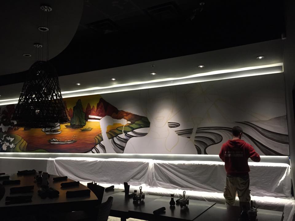
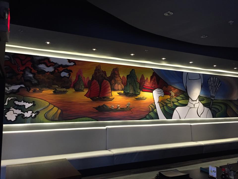
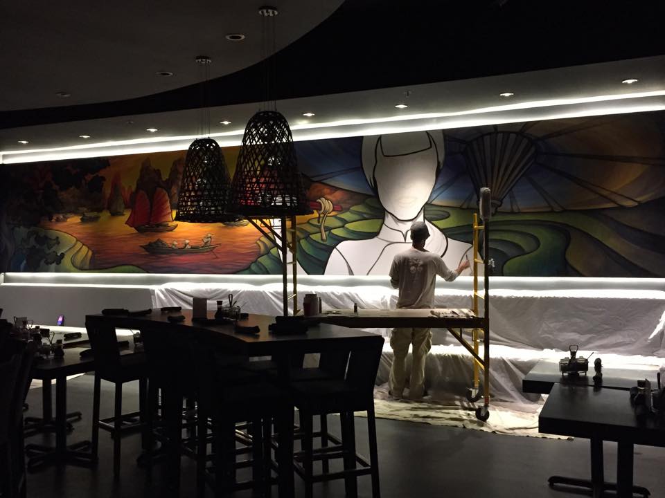
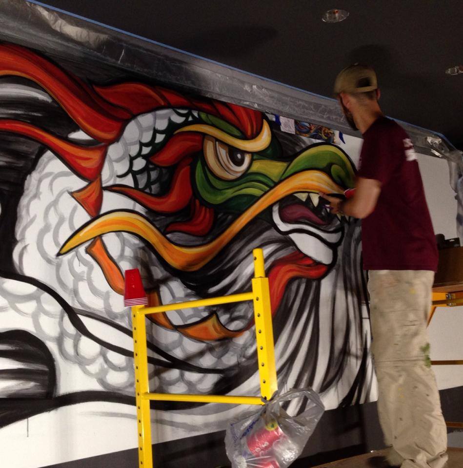
The first mural we decided on was the dragon mural. Dragons are common in Chinese motifs, and Cindy found a dragon she fell in love with instantly and had been holding on it to for quite some time. In fact, initially, she wanted to see if the Historic Board of Review would allow it on the outside of the building in the historic downtown area. The second mural was the Vietnamese lady. The girl with the hat and boats in Halong Bay in the background were prefect to represent Vietnamese culture. We worked hours and hours compiling motifs and images for the murals, reviewing the edits Marc made, and continued to have him recreate the preliminary sketches. I thought he was going to fire us as clients. 😉 He was patient and helped guide us to and away from certain ideas that may not work on such a large scale and both murals came out fantastic. Scroll down about half way to see the project. Huge thanks to CODA for including us in this issue.
https://flipboard.com/@codaworx/codamagazine%3A-transformative-walls-it6a307oy
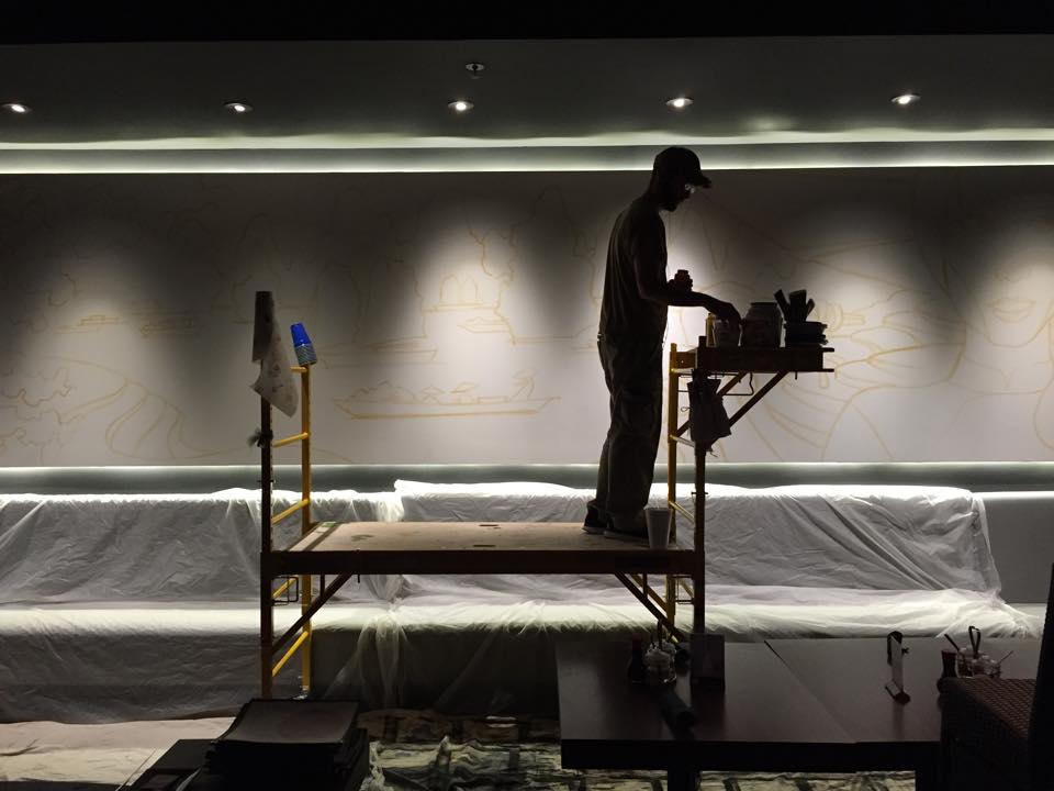
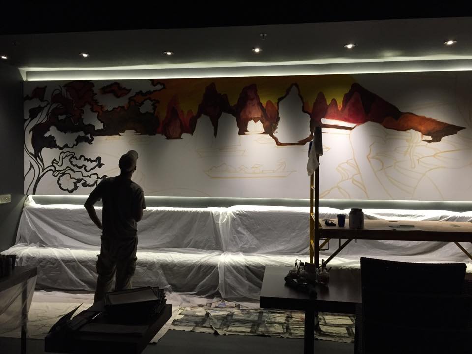
It took him about a week to paint each one, working nights after the restaurant closed. I’ve included some of his WIP (work in progress) pics below, because I know those are always fun to see. For me, preliminary sketches and progress pics of how an idea comes together are more interesting sometimes. It show me how artists work and how they think.
More on the process for House of Lu soon. I can’t wait to share pics and stories about Thailand with you.
xoxo,
Cassandra
