Not Too Pretty | Not Too Gritty
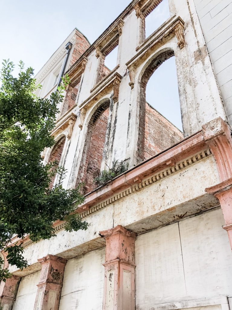
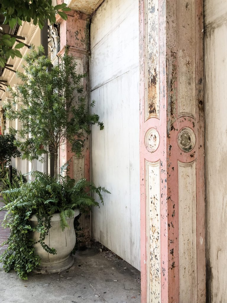
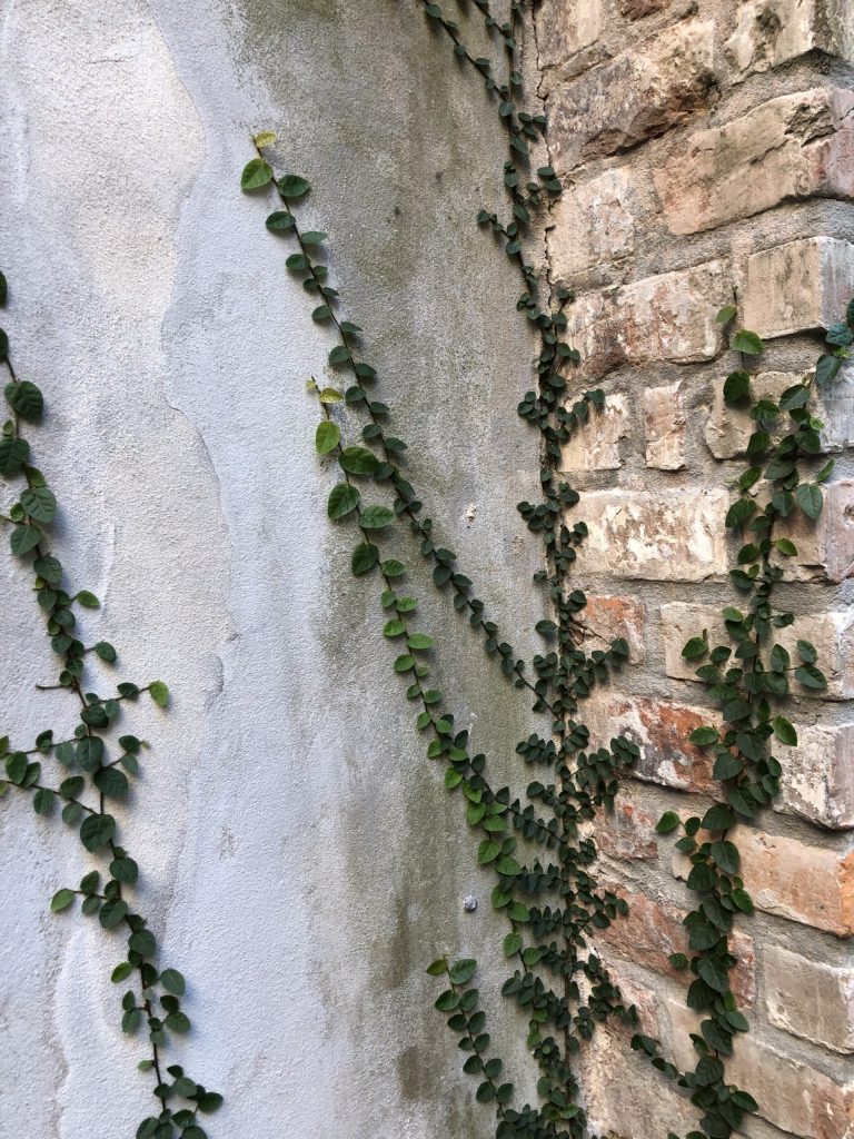
Design lovers headed to New Orleans have to make a stop at newly opened The Eliza Jane. Easily one of my new favorites. Located away from Bourbon St. in the Central Business District, for those who prefer a little something other than that scene, yet it’s still walking distance to the French Quarter. The hotel takes up several historic renovated warehouses and occupies what was previously Gulf Baking Soda, Paychaud Bitters Factory, and The Daily Picayune, and takes its namesake from the previous publisher of the newspaper, Eliza Jane. Jane was the country’s first female publisher, turning a small newspaper into a nationally recognized one. Next door you’ll find this old architectural treasure sharing similar round details on the columns as the the hotel itself but remains as just a facade today.
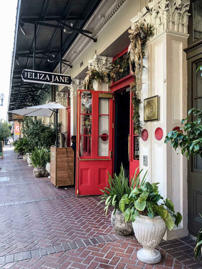
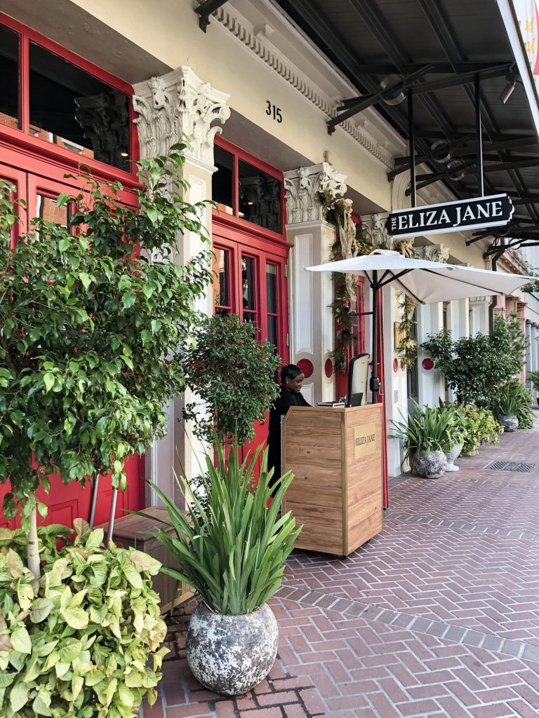
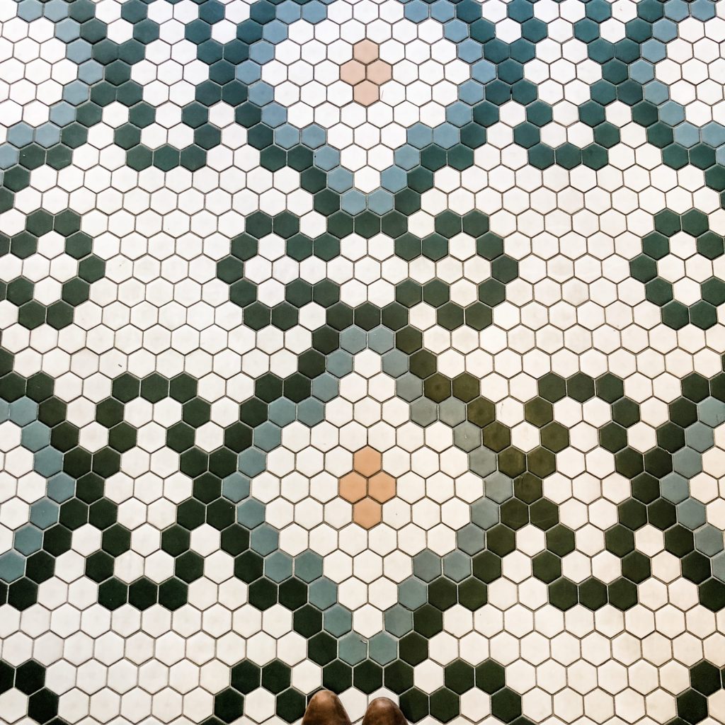
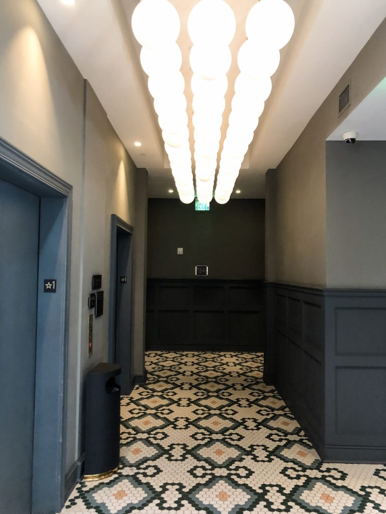
Original historic details were preserved when possible, exposing and restoring much of the brick archways and metal structural components, while opening up the multiple, adjacent warehouse spaces as much as possible. Upon arrival guests are greeted with red doors, mosaic tile floors and an original fireplace that remains behind the front desk painted the perfect blue with a calming seafoam color on the walls.
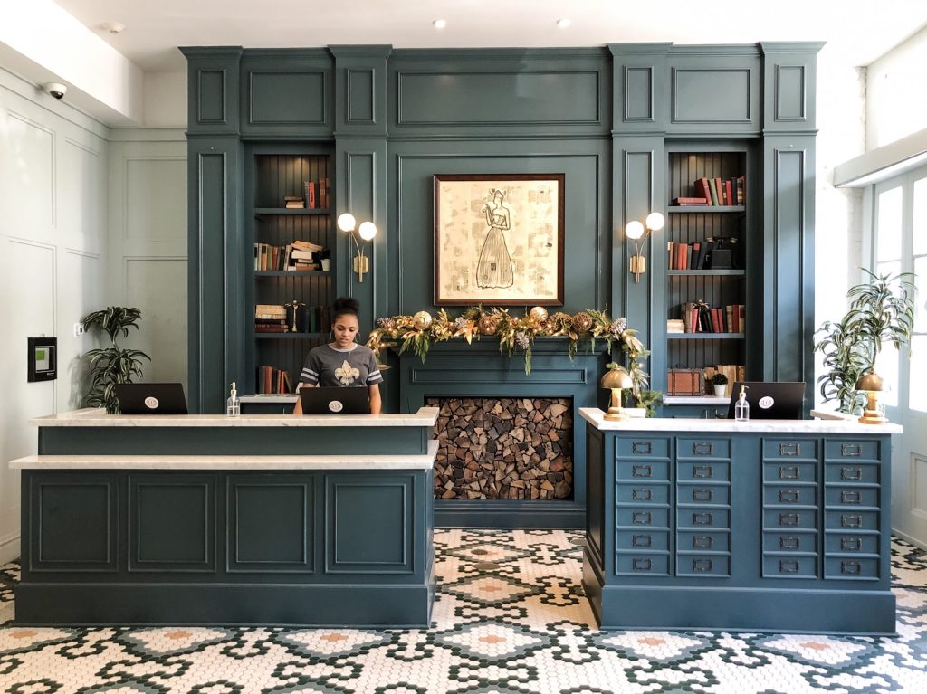
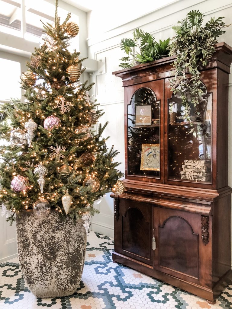
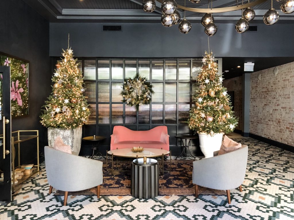
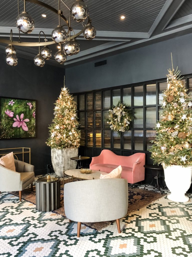
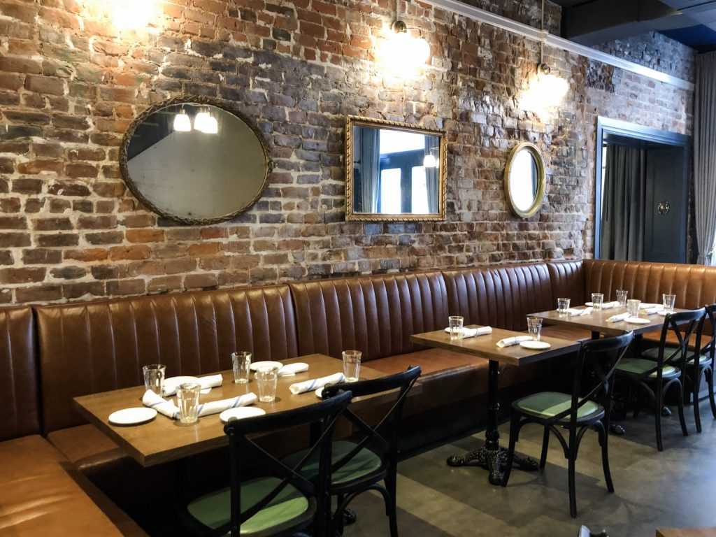
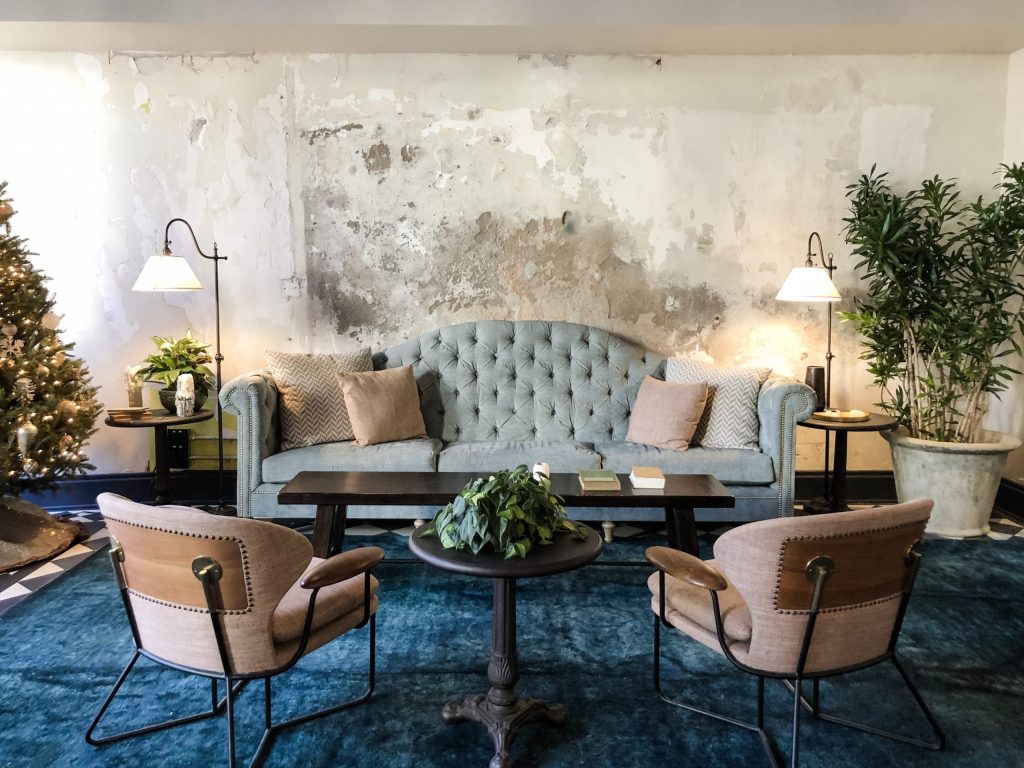
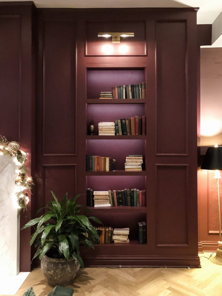
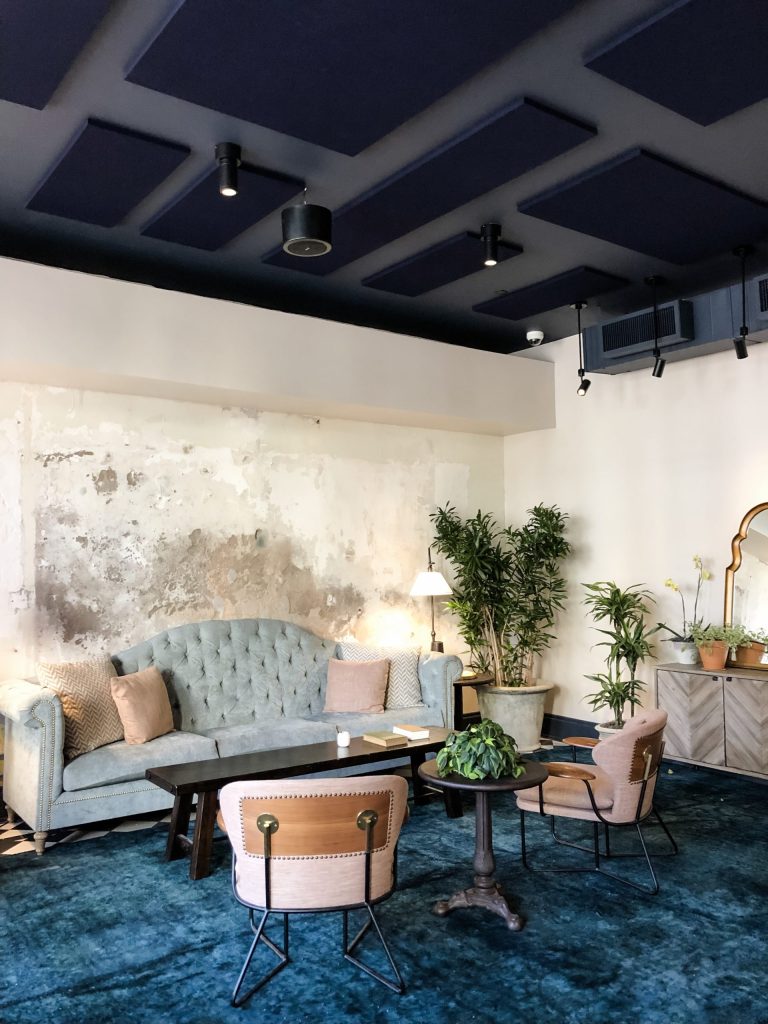
Hints of the previous lives of these buildings are seen throughout the spaces. It’s that industrial mix of raw materials paired with soft velvety fabrics in rosy pinks, as seen in the pics above and below, lavenders and greens, with plum and eggplant jewel tone colors, specifically chosen for their femininity and to pay respect to Jane herself, create a charming and cozy atmosphere that’s not too pretty and not too gritty. I also love how the use of green, gold and violets in the design speak so perfectly to the New Orleans culture. These are in fact the town’s colors.
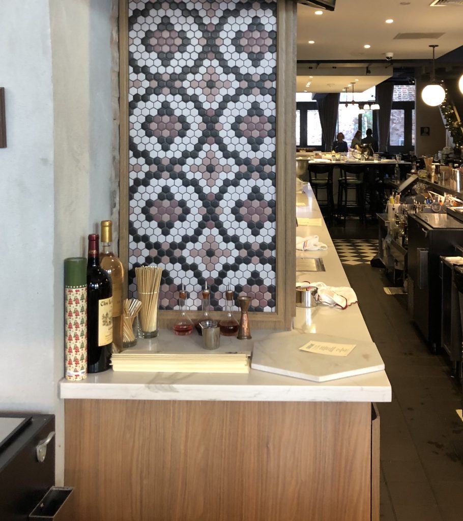
The French brasserie Couvant, connected to the hotel, occupies the space the bitters factory previously did and serves up a dose of French fare with New Orleans flair.
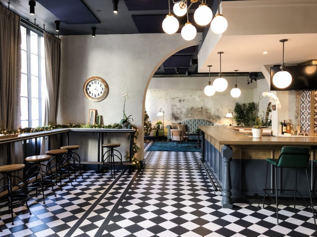
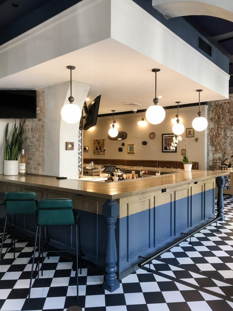
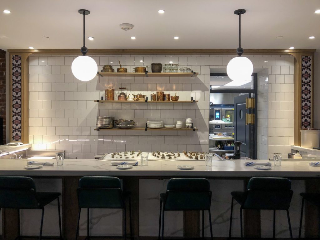
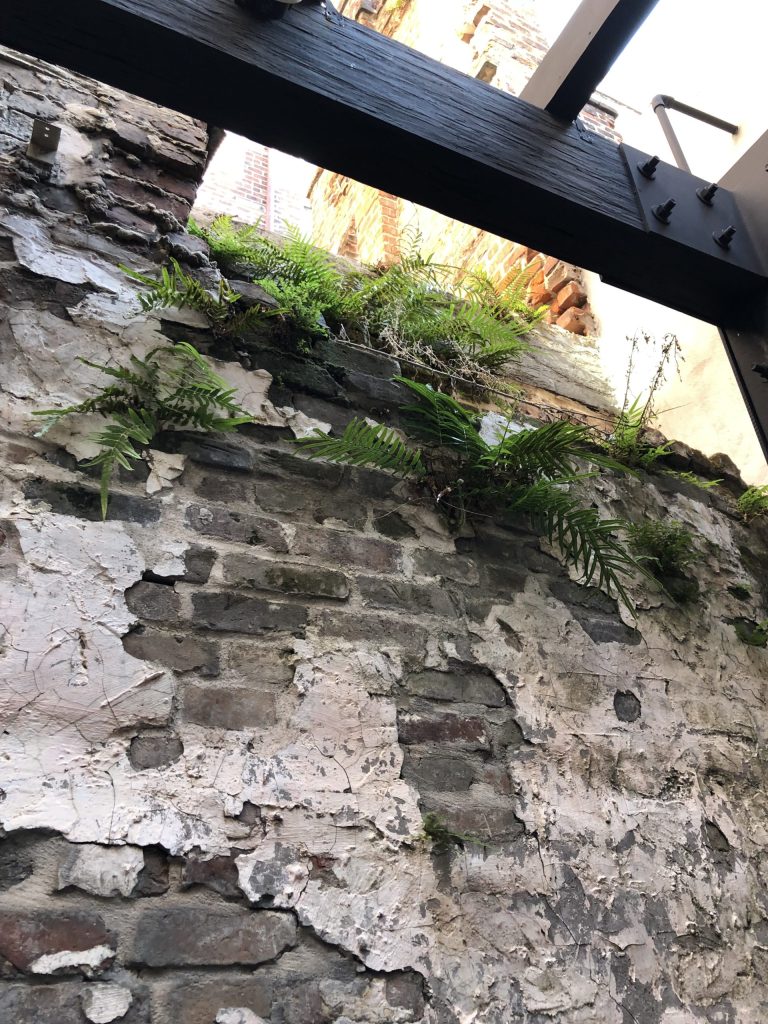
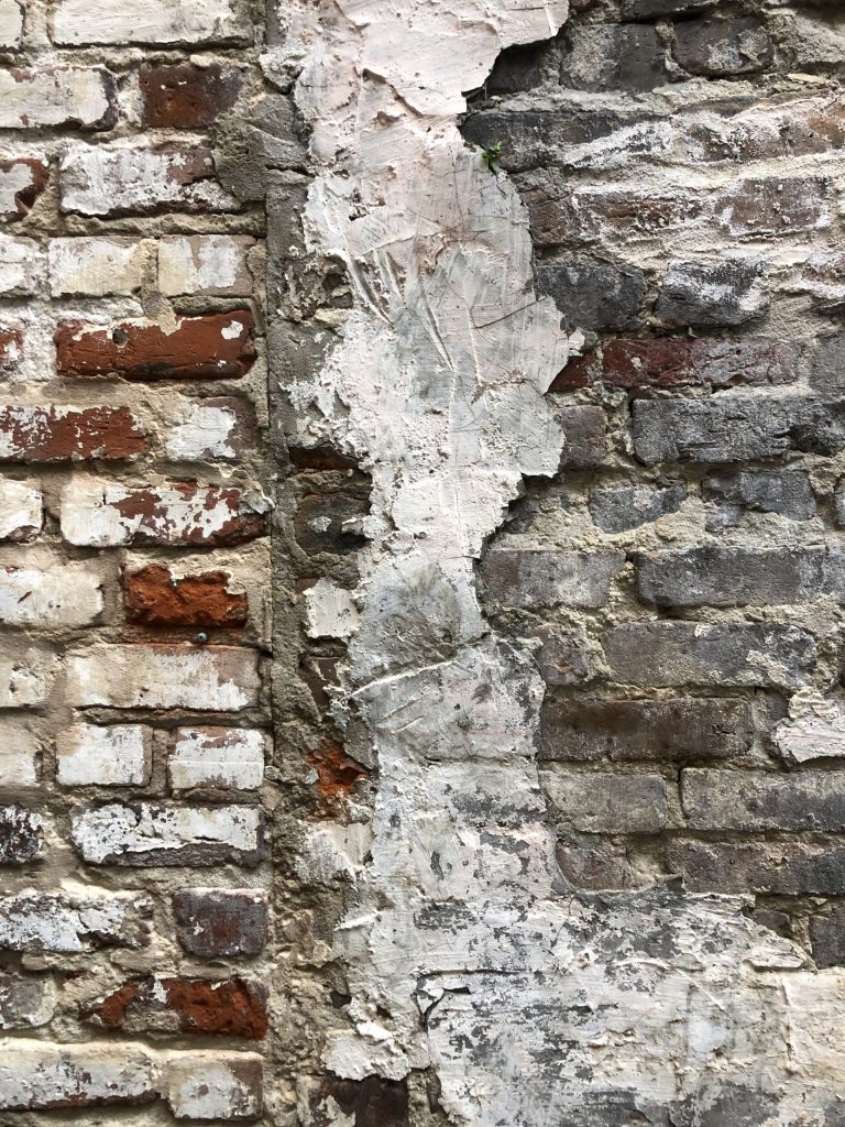
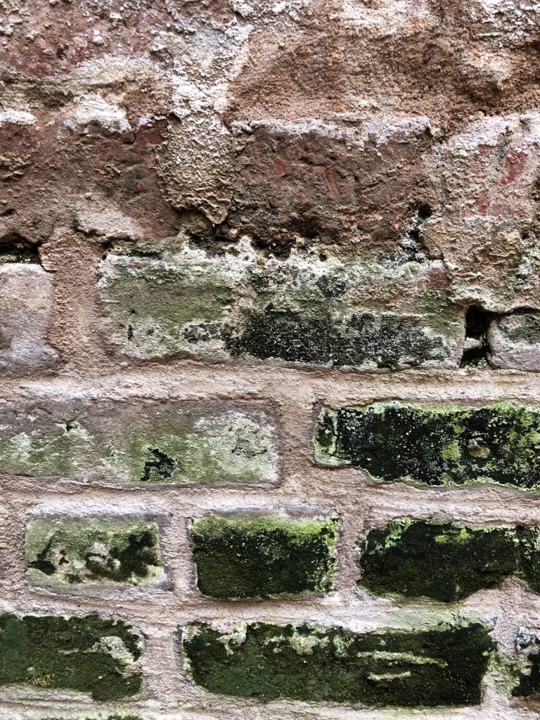
The courtyard, known as Bisous Wine Garden, offers organic, sustainable wines from small producers, plenty of areas for lounging, a fireplace, fountain and opportunities to create new stories surrounded by the old textured brick walls with years of stories of their own. You just can’t recreate the kind of look and feel that history provides. Little vignettes of outdoor seating are perfect for finding a spot to hide away from the energetic chaos that can be New Orleans.
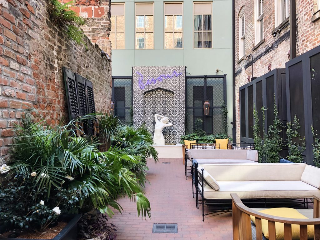
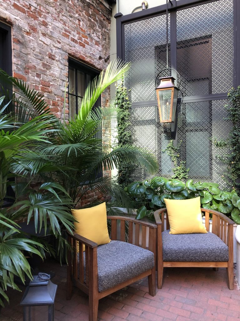
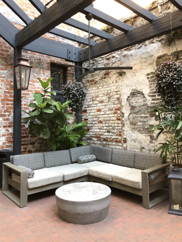
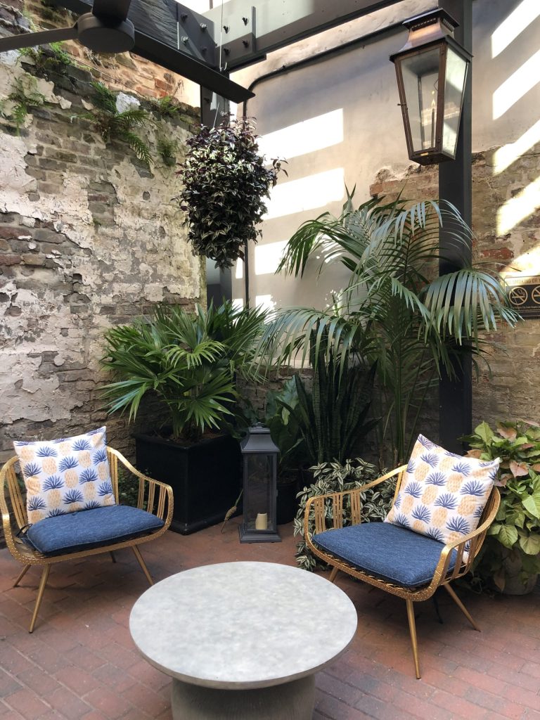
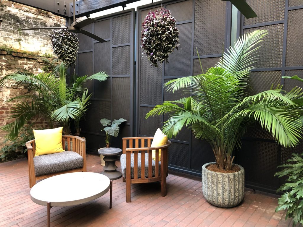
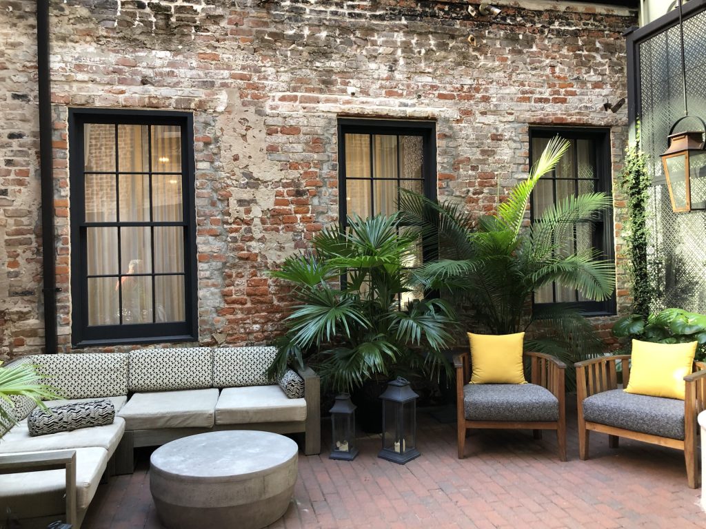
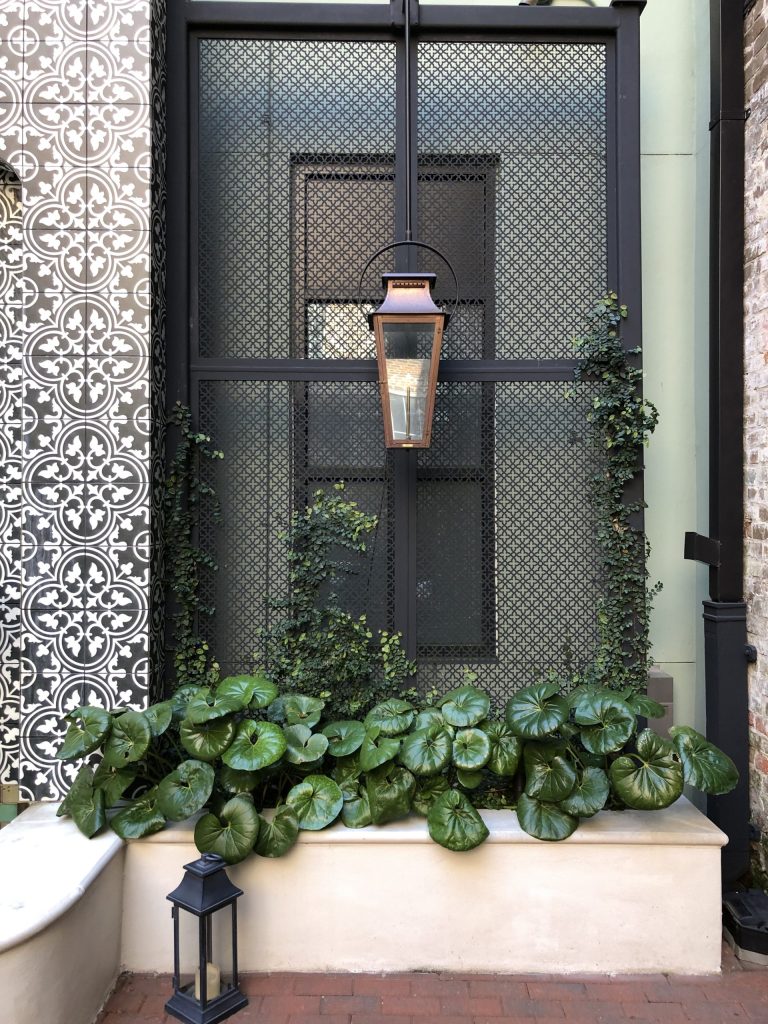
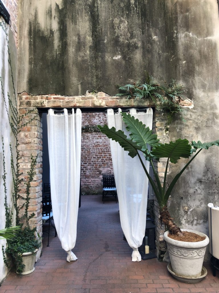
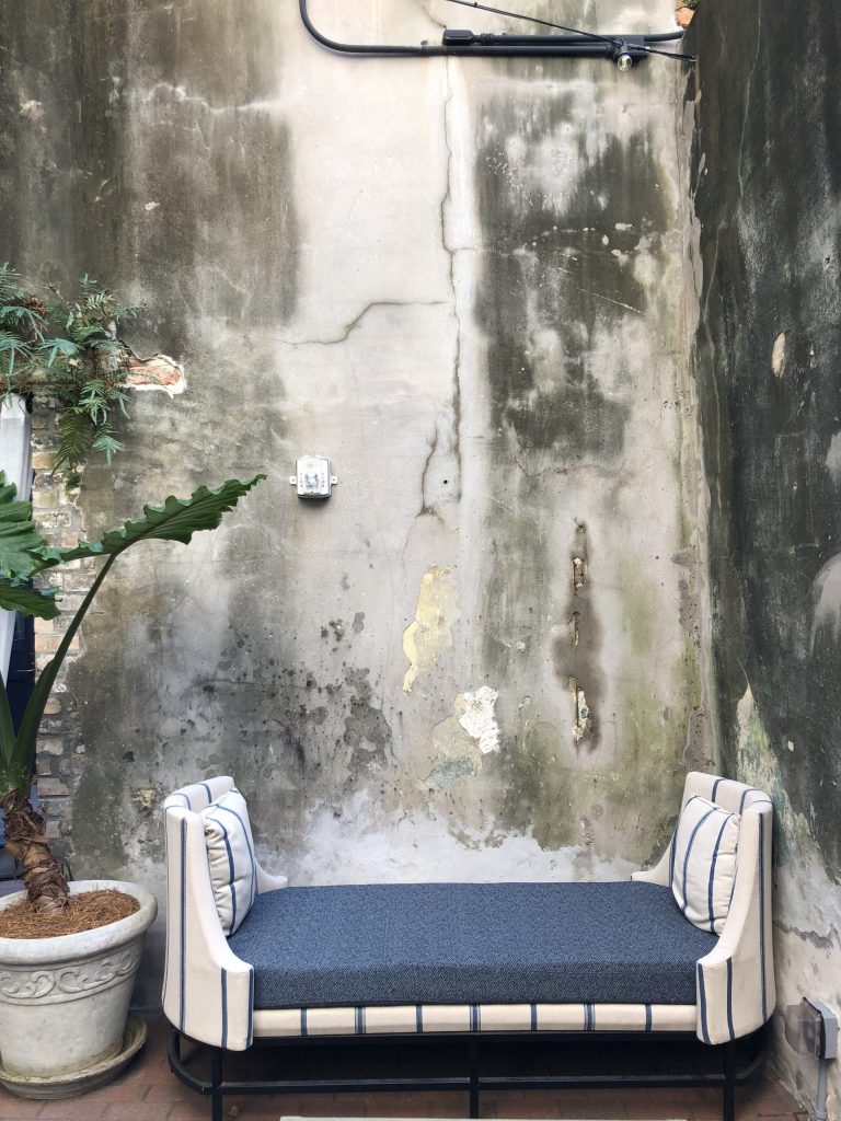
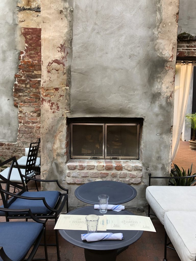
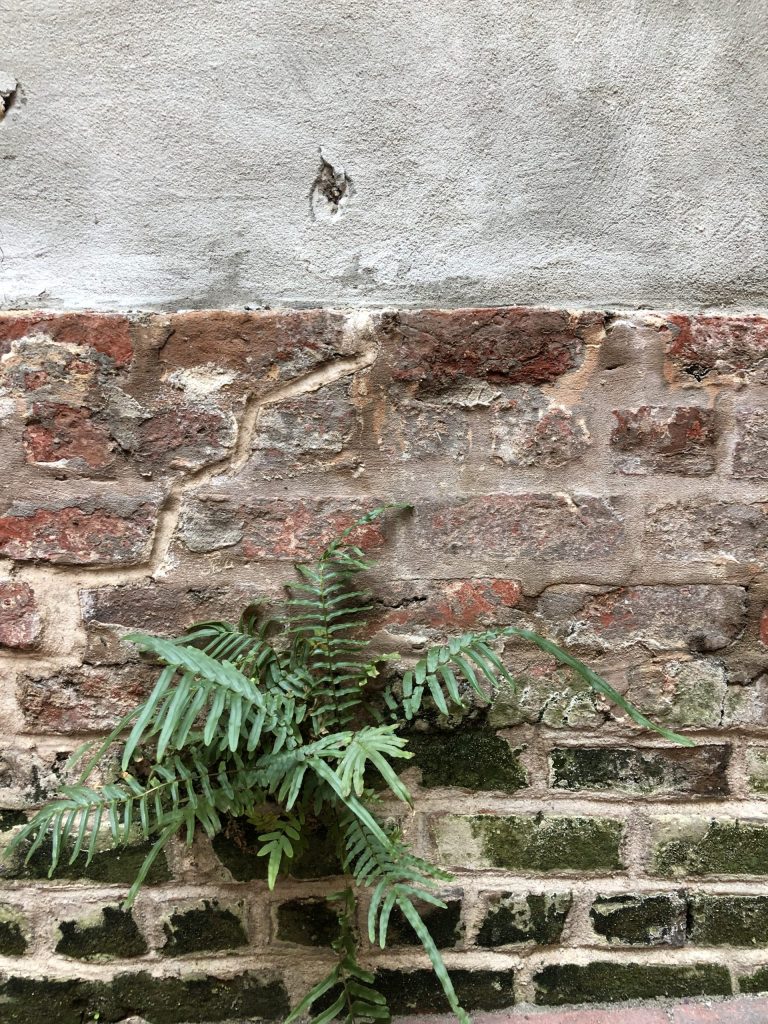
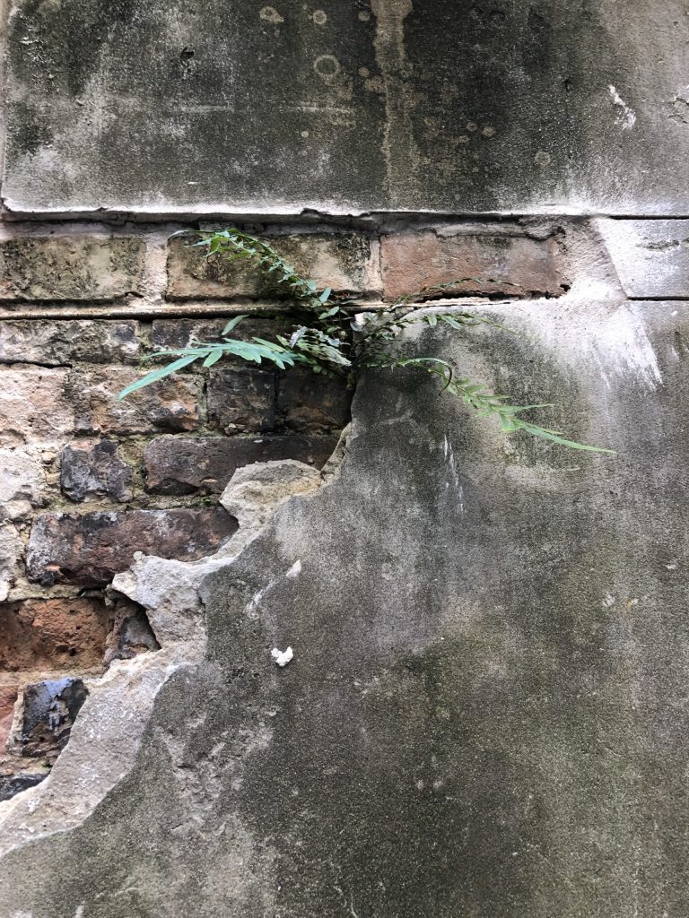
Nature puts on a display here and there in the courtyard, as she shows how very little she struggles to find the perfect spot to grow between concrete and brick, adding just a touch of life to the hard materials. And those mossy bricks are perfect.
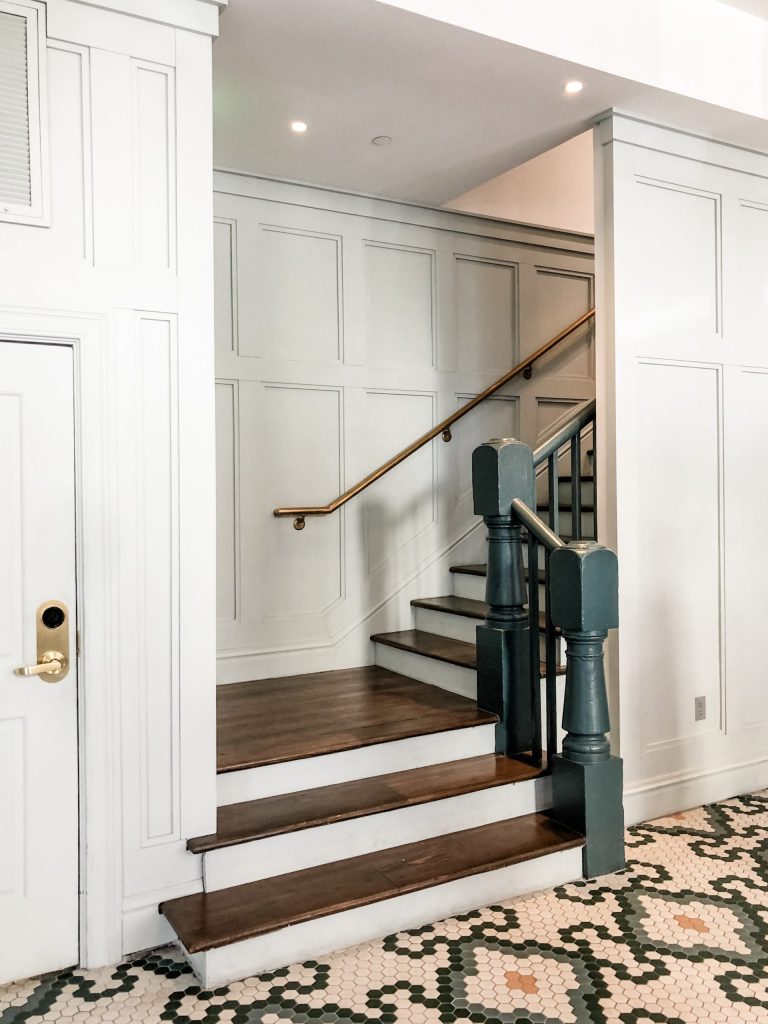
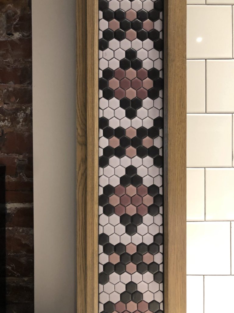
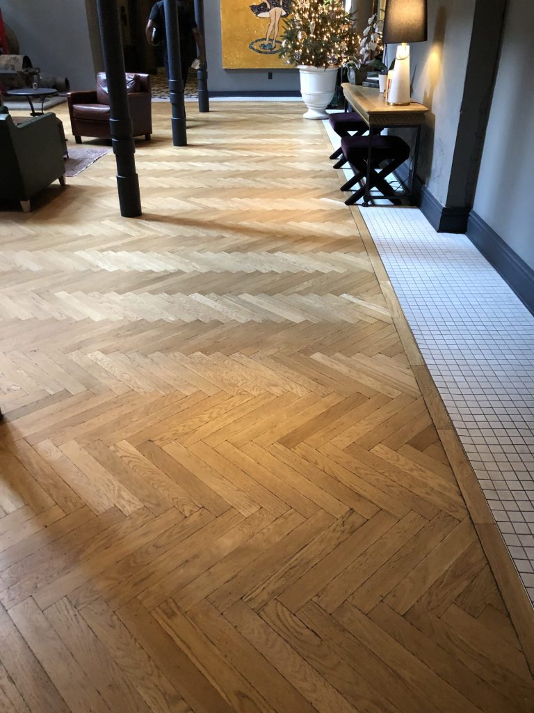
Some of my favorite things are the details. The factory style window in the above picture, both appropriate for the space’s age and previous warehouse function, now allows light through to the space behind for its modern function. The tile mosaics throughout, the newel posts on the stairs near the front desk, the wainscoting in the hall, the built-ins in the library lounge, the herringbone wood floors, even down to the acoustical panels on the blue ceiling. With that much tile, brick and stone, as designers, we always have to remember the impact of the material choices we make. It’s not just about making it pretty, it’s looking at things closely, like how all these hard surfaces will impact the sound of the space and what we can do to mitigate a problem ahead of time.
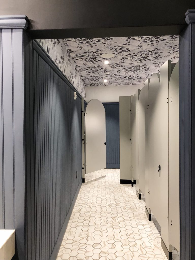
Speaking of mitigating a problem…I also love the use of the wallpaper on the ceiling in the restroom. It adds a great deal of pattern and personality, without being on the walls down where water (or worse) might splash on it or where curious fingers begin the peeling process. Yes there are vinyl papers specifically for restrooms, but this just takes human contact and all that comes with that out of the equation by mitigating a problem to begin with. I have learned from commercial design projects, humans have become more and more disrespectful in public spaces and minimizing any contact helps. It’s also just easier for staff to clean tile walls in a public restroom.
This truly memorable space was designed by Stonehill Taylor. To find out more about this hotel you can find their website here.
Hope you loved this recently opened design destination!! Let me know if you’ve been and what you thought about it!
xo
Cass
