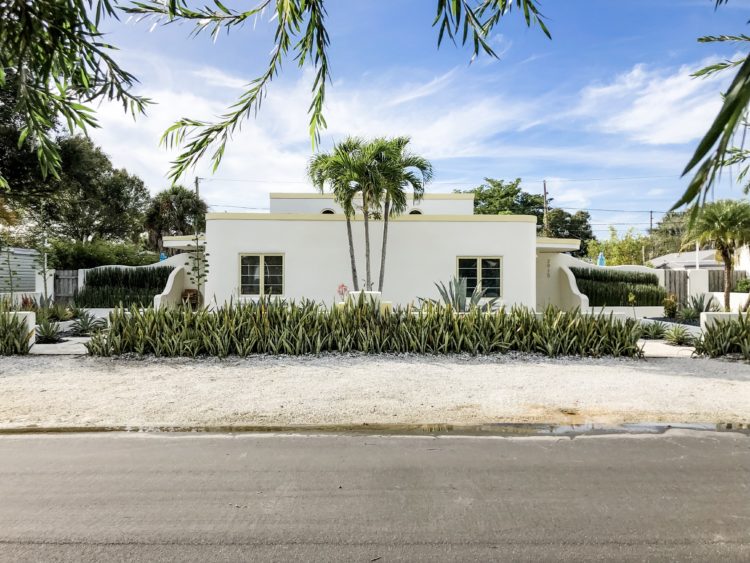
Renovation of an original 1938 Art Deco residence
A reference companion to the two part vlog series on Art Deco style. Be sure to click the thumbnails below, so you can see the entire image.
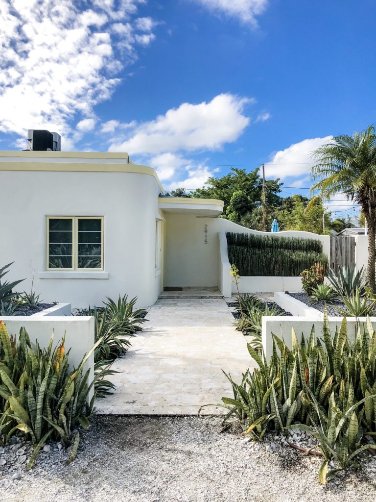
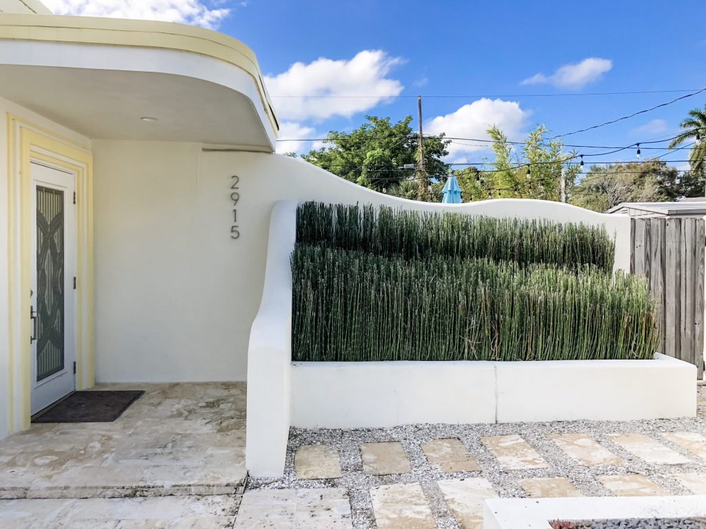
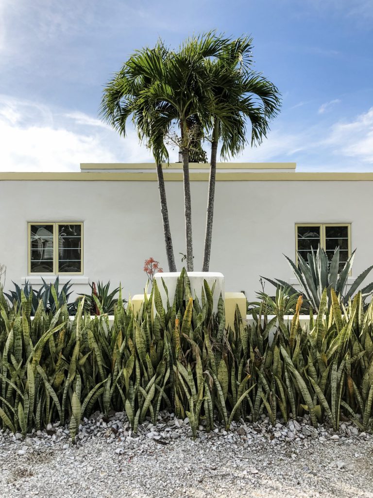
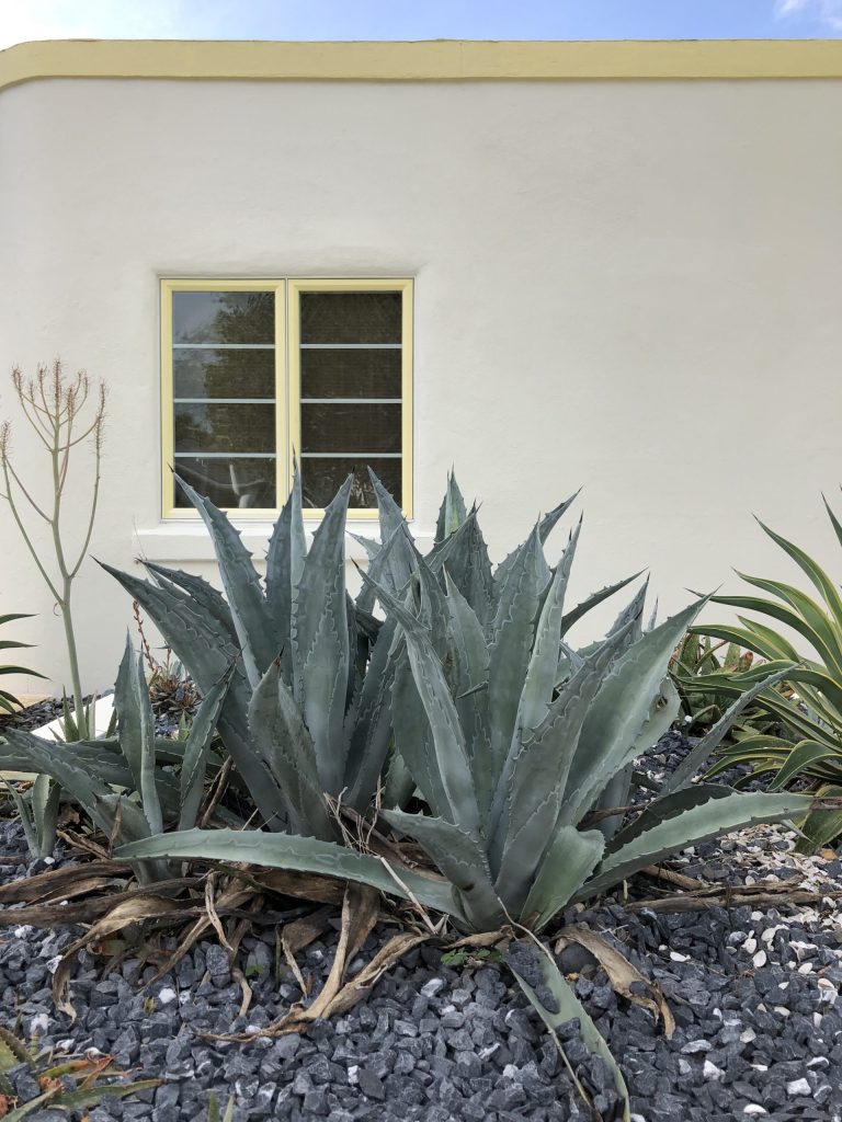
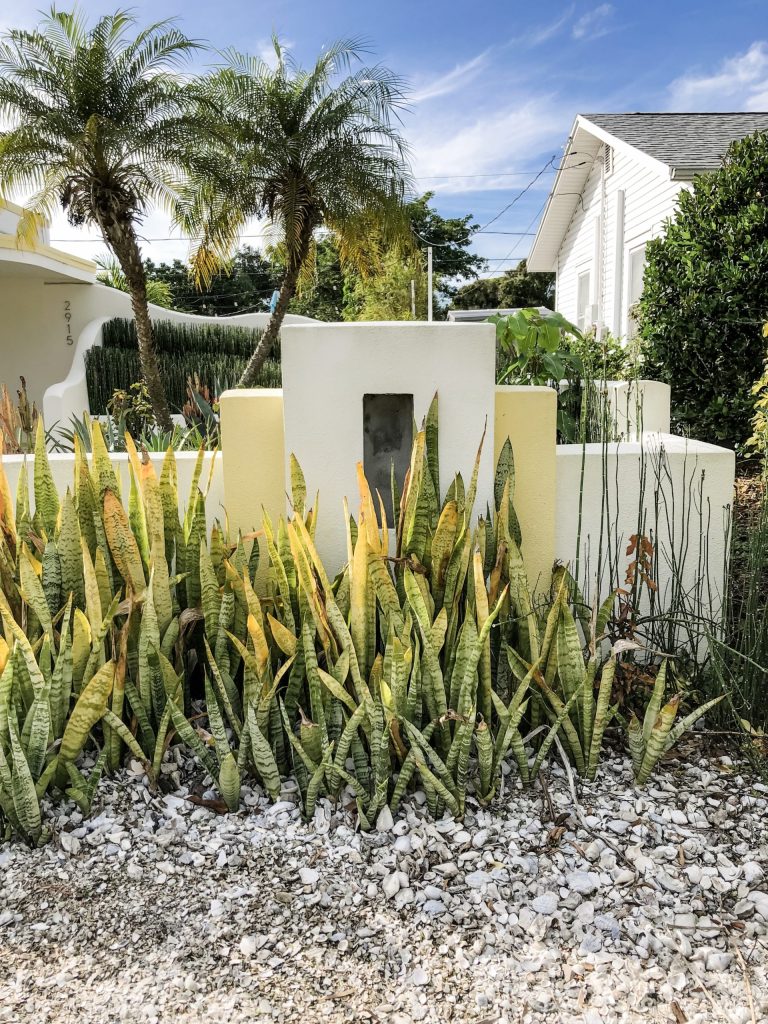
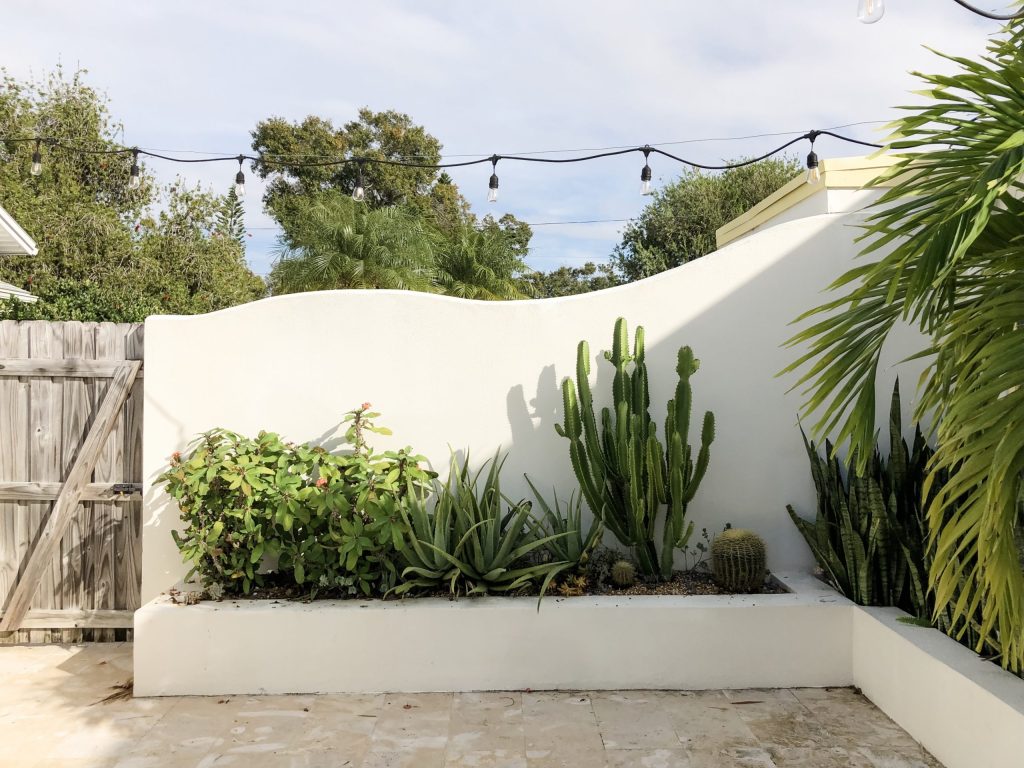
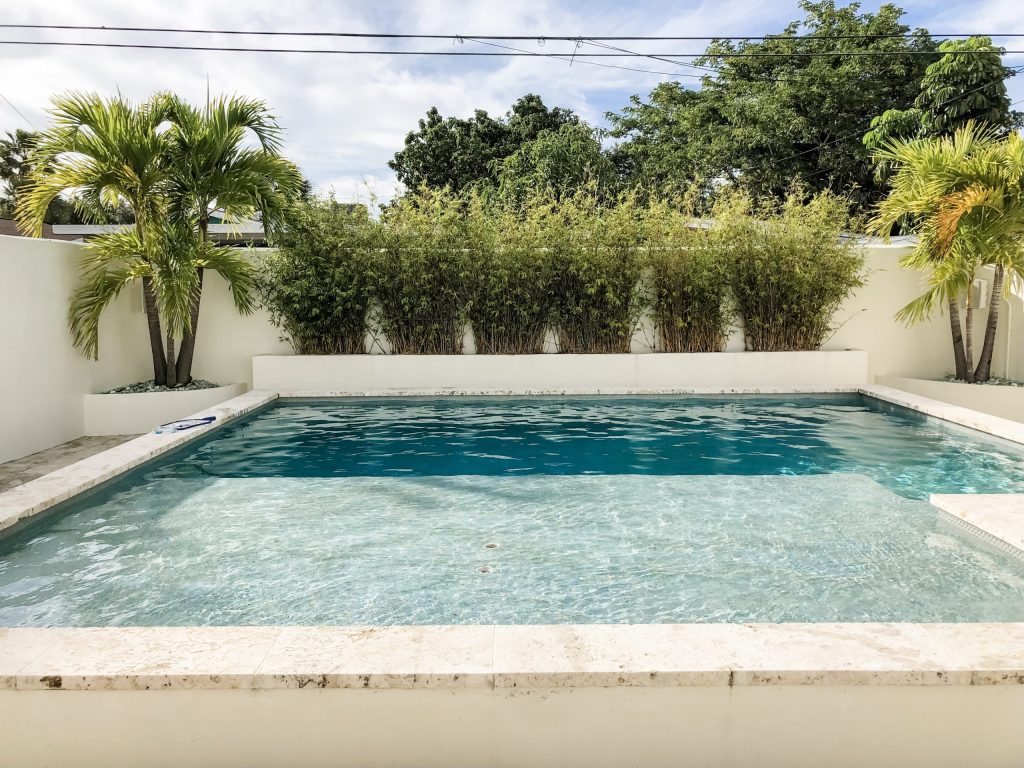
Before we begin, I’d like to make the reader aware, this is not a project designed by my design firm. It is a project I admire and wanted to share here in an effort to showcase what it’s like to carry a strong consistent design concept throughout a project. I hope you enjoy it!
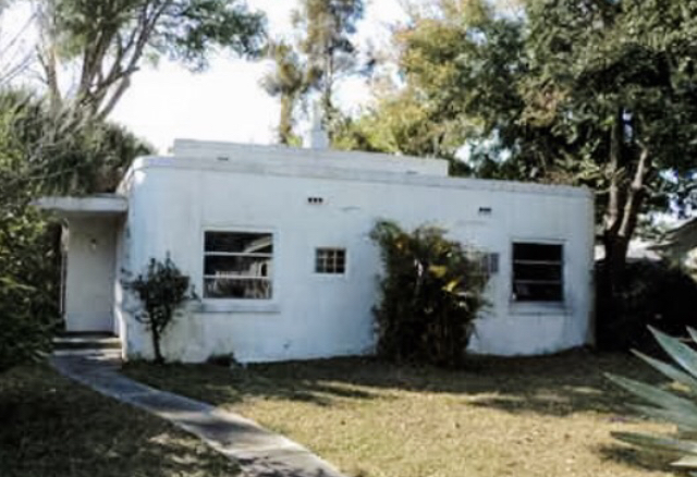
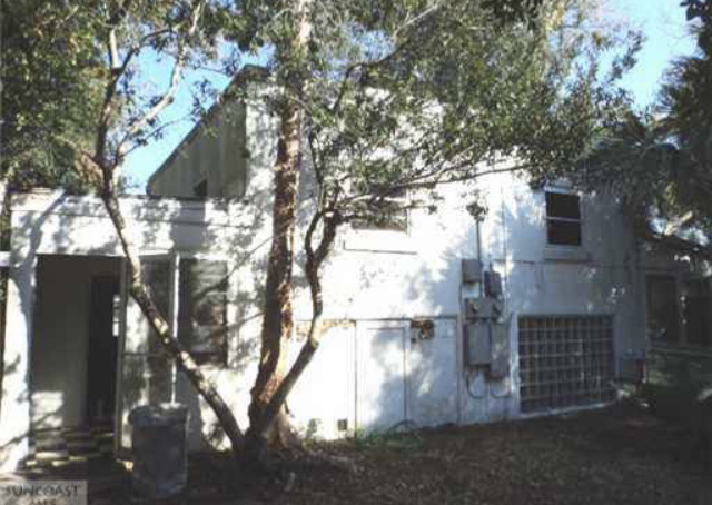
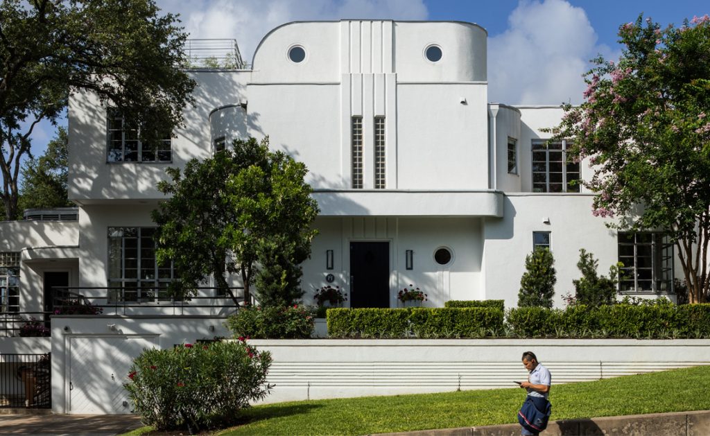
Below are two pictures of what the original structure looked like, prior to the renovation. Although we can already see the presence of Art Deco design vocabulary, the renovation takes the concept to a higher level of expression and a deeper appreciation of the style. In this original interpretation, we can already see the curved walls, the horizontal window frames and the existence of the glass block mentioned in the vlog.
Ancient Temples and Ziggurats
An image of the ziggurat technique used in ancient temple design can be found by clicking here. From this image we can clearly see the terraced or tiered birthday cake shape.
Existing Ziggurats in Art Deco
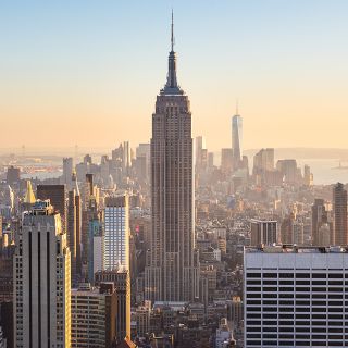
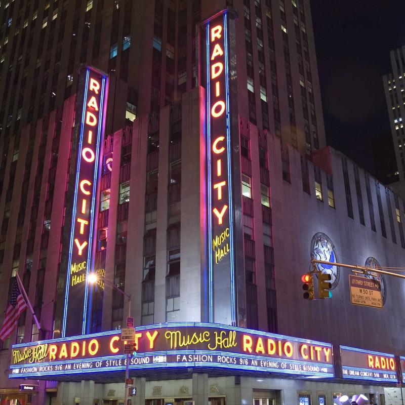
As referenced in the video, ziggurats are seen in the Empire State Building and Radio City Music Hall in New York, as well as, the Earl and Rachel Smith Strand Theatre in Marietta, just outside of Atlanta. It’s also important to note that the zigguart was not only an architectural element but was also a design motif.
Ziggurats as Design Motifs
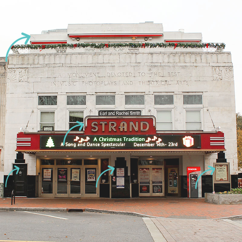
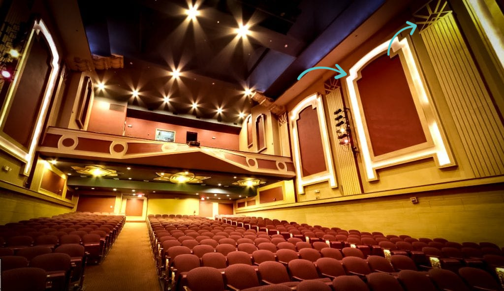
In the case of the Strand Theatre, if you look closely over the left side door, front of the box office, and far right over the glass poster box window, the ziggurat is present. Here it is rendered in a black material resembling glass, creating the profile of a birthday cake at the top of the door and signs. Since we are discussing this building, if we take an even closer look, the same shape is reflected inside at the top of the interior light cove moulding elements in the auditorium, where a setback is created in the moulding design.
It is also present in the marquee on the front of the building with a series of cake like tiers, reiterating the terraces found in the Art Deco design style. In Art Deco design, if ornamentation was used, it was very low relief (shallow in depth or thickness) unlike previous periods, which is why these ziggurats on the exterior, and any other decoration used during the period, are relatively flat looking. Remember, this period was about a more streamlined look and feel.
I’ve used blue arrows to call out the elements below. As mentioned in the video, geometric shapes and linear forms used both vertically and horizontally were widely used, as well as, sunburst or sun ray patterns. In the interior photo below, you can clearly see the long linear line pattern running vertically on the walls, crowned with the geometric shape in the form of the triangle and the sun ray design motif. This sun ray motif is also what gives the Chrysler Building its iconic ziggurat and recognizable top. Other design motifs frequently found during this period are fans, chevrons, and line work in an array of geometric patterns.
Art Deco and the Machine
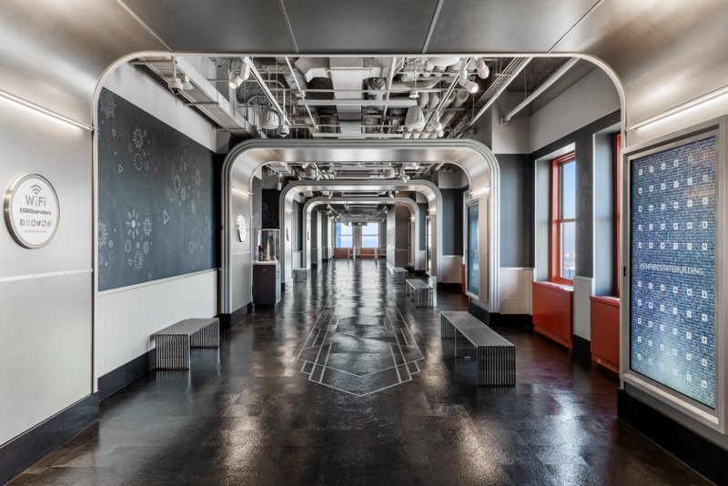
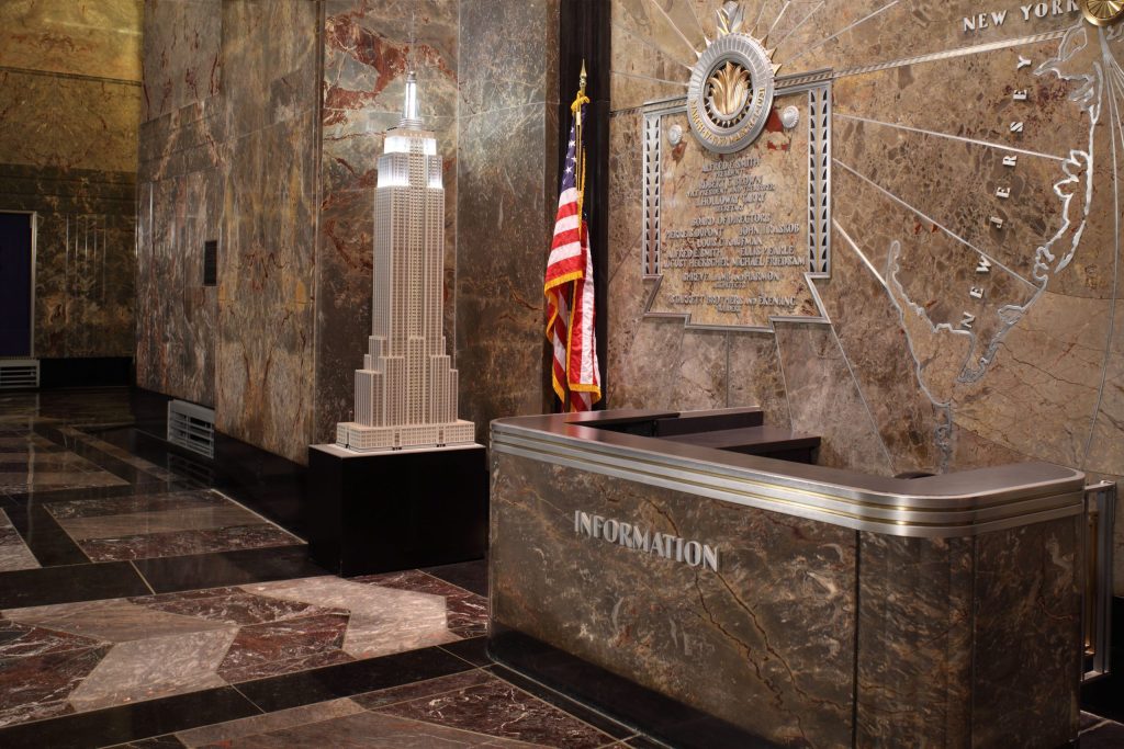
During this period, the industrial or machine-like aesthetic was popular, with very sleek materials in aluminum, steel and glass. Objects and materials that had an automotive or aviation-like feel were highly desired. This style was meant to look monolithic, sharp, angular and luxurious. Notice the machine-like feel, the chevrons in the floor pattern, and the metal around the information desk in the Empire State Building interior.
Art Moderne and the Curve
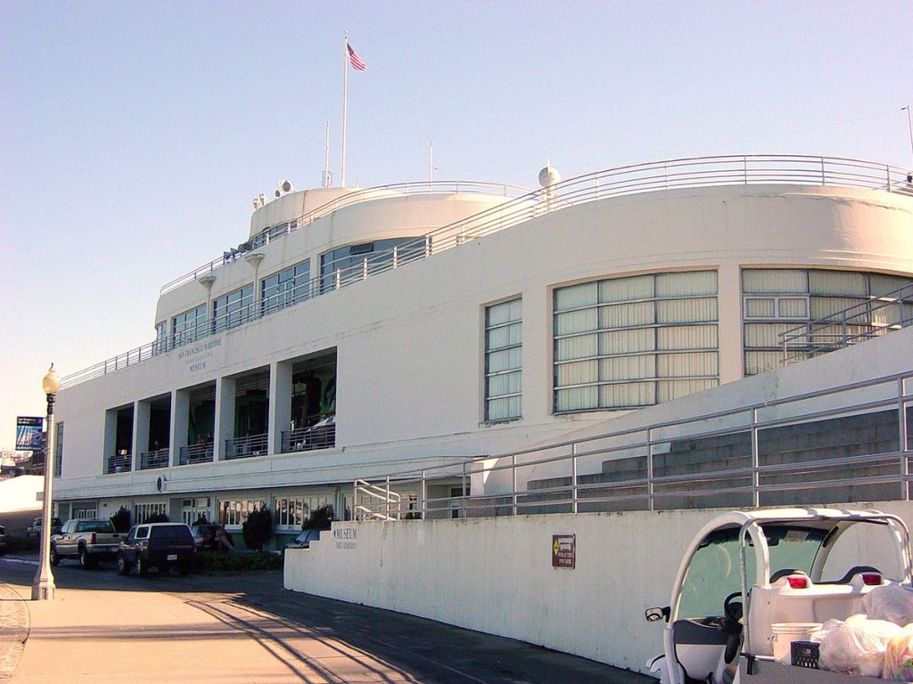
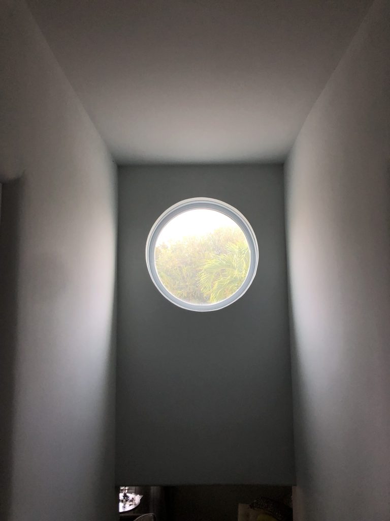
Towards the end of the period we start to see more stucco, rounded corners and the appearance of the wave. Below we can see the curving walls, the horizontal window frames, the presence of the ziggurat in the structure of the buildings, and how, like the residence above, this style feels more horizontal in nature rather than vertical. We can also see the oculus windows mentioned in the vlog.
Interiors, Furnishings and Decorative Arts
Many of the same materials were popular for the interior, as you’ve seen above and in the vlog. Below are references for some of the interior elements discussed. It should be noted, many of the furnishings in this house, due to it being a vacation rental, represent more budget-friendly furnishings and decorative arts that still check off many of the boxes of the design style.
Barcelona chair designed by Ludwig Mies van der Rohe
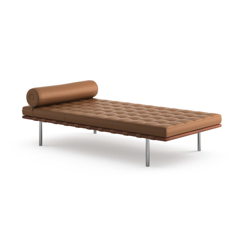
The chair, along with the companion piece, the day bed (or technically called couch) I mentioned in the video (which I especially love in the tan color) is below. It should be noted, this is a more high-brow Art Deco period representation than what we see in this house. And we should also understand, Mies van der Rohe, and his work, were very associated with the Bauhaus Movement. He was the last Director of the Bauhaus School of Design prior to its closing in the early 1930’s due to the Nazis. This chair below was designed for the German Pavilion at the Paris Exposition where Art Deco was introduced. Because Bauhaus was ending, and because this chair was introduced at this exposition, it would have been a popular chair during this time period, and therefore would have been an appropriate addition to a 1930’s home.
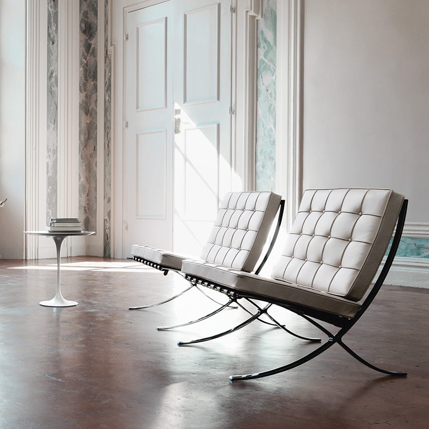
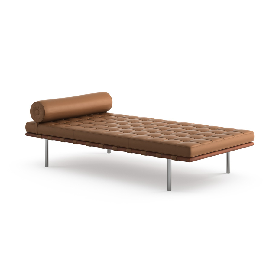
This chair is widely knocked off and less expensive versions can be found. If you are interested in an copyrighted reproduction of the chair, signed by Mies van der Rohe himself, it can be purchased through Knoll by clicking here. The couch is on the site, as well.
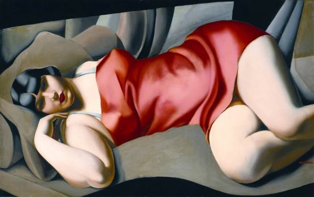
Original Art Deco paintings by Tamara de Lempicka
Kitchen: Autoportrait (Tamara in a Green Bugatti), 1929.
Bedroom: The Pink Tunic, 1927

Interior Details
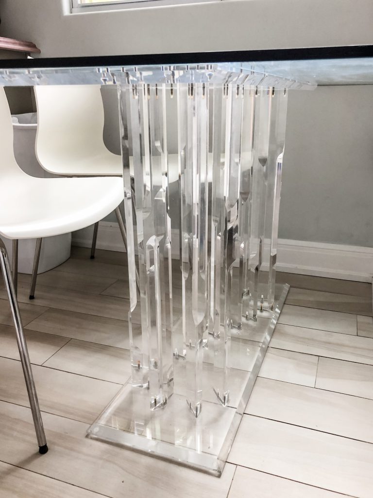
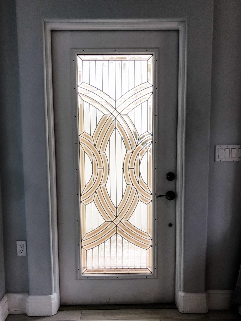
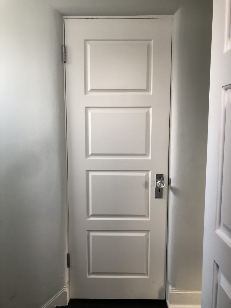
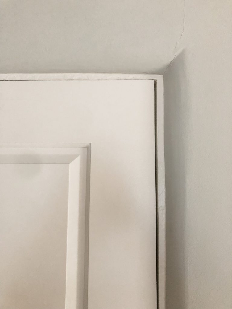
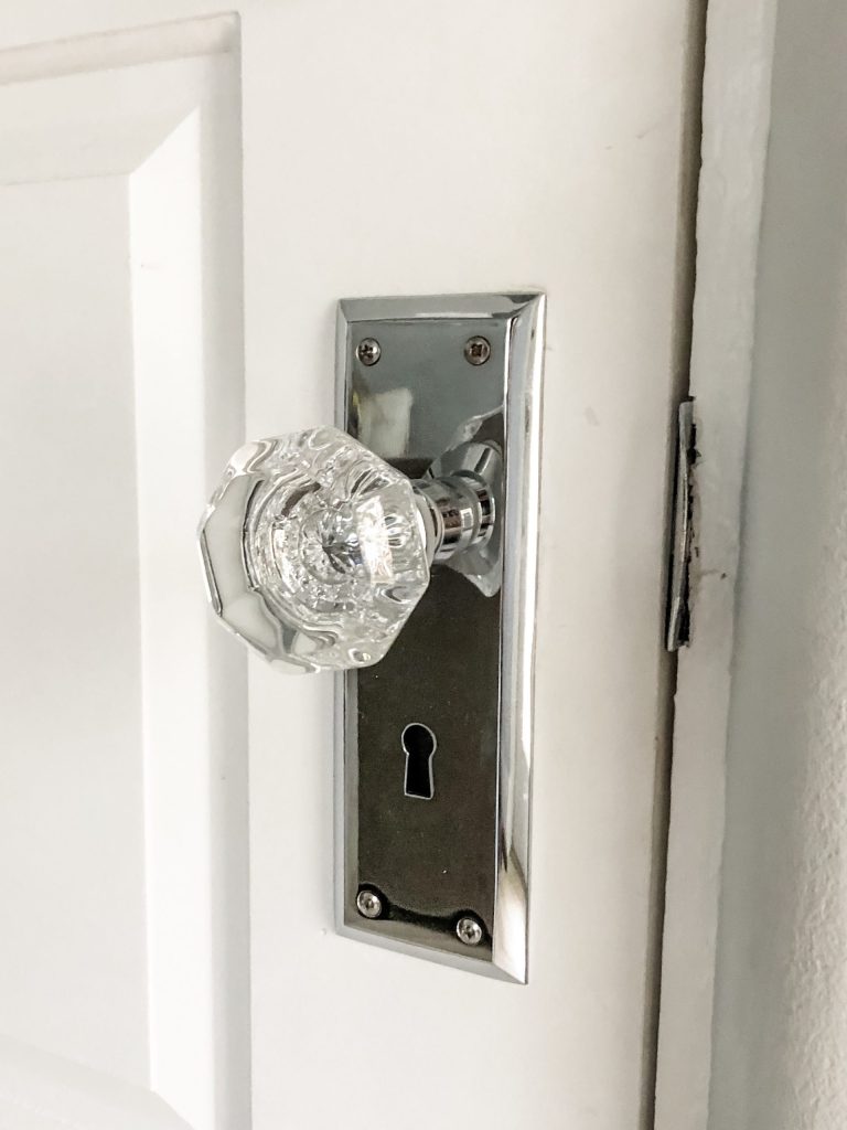
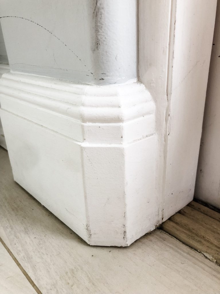
Below are photos referencing some of the interior details discussed in the vlog. Notice the rounded corners around the doors, the linear vertical lines created by the table base and the lines and geometric shapes in the door glass, and if seen side-by-side, the baseboard detail looks like a mini Empire State Building from the picture above, without the spire.
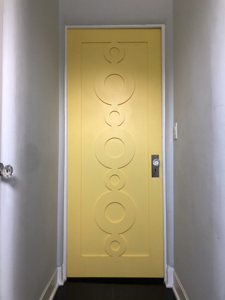
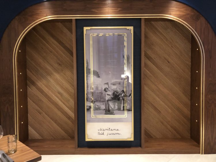
In the next post, I’ll share pictures of my visit to The Don Cesar, another Art Deco interior project that features a bit more high-end Art Deco style, so you can see how this style is still very relevant as a gorgeous, modern, design concept today. Here is a teaser image for that post. Doesn’t it remind you of the shape of the corridor of the interior of the Empire State Building in the above picture? Are you starting to be able to recognize some of the features? I’d love to hear if this has helped in any way or given you a greater love or at least appreciation for the style!
Hope you enjoyed it! Thanks for reading!!
Cass
Xo
