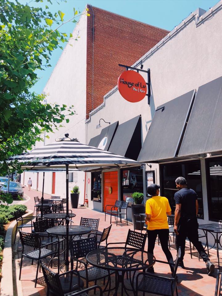
A family owned Chinese restaurant that had been in business going on 20 years, desperately needed an update. Reinventing the entire restaurant brand, interior and exterior, logo, and menus was needed to take this restaurant into the future. From the beginning, the idea was to avoid any of the cheap, cultural themes commonly seen in Chinese restaurants yet respect, express and elevate the culture in a vibrant way.
Upon starting the project, the client gave me a piece of Chinese currency. The center of the coin had a circle cut out of it. After researching Chinese design, culture and furniture, this circle was a common shape, whether it was the currency, the shape of an escutcheon on a Chinese wedding cabinet or the basic shape for the yin and yang symbol. This circular shape would lead the design and eventually become the basis for the entire restaurant.
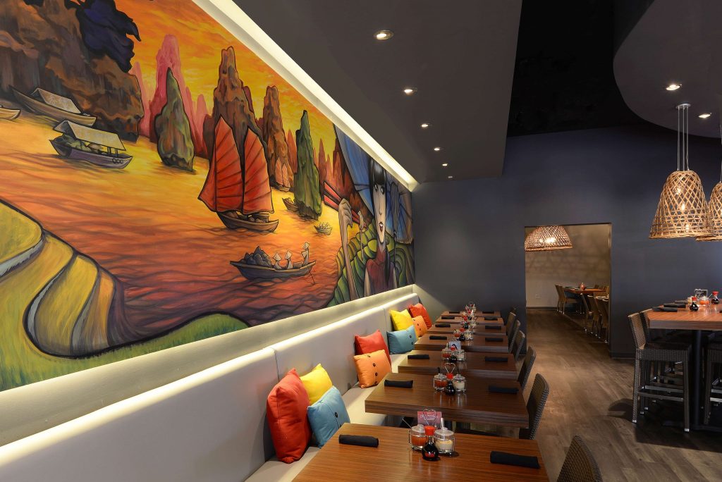
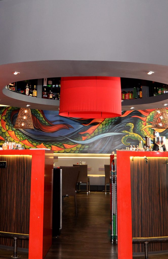
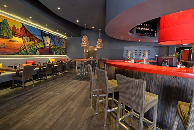
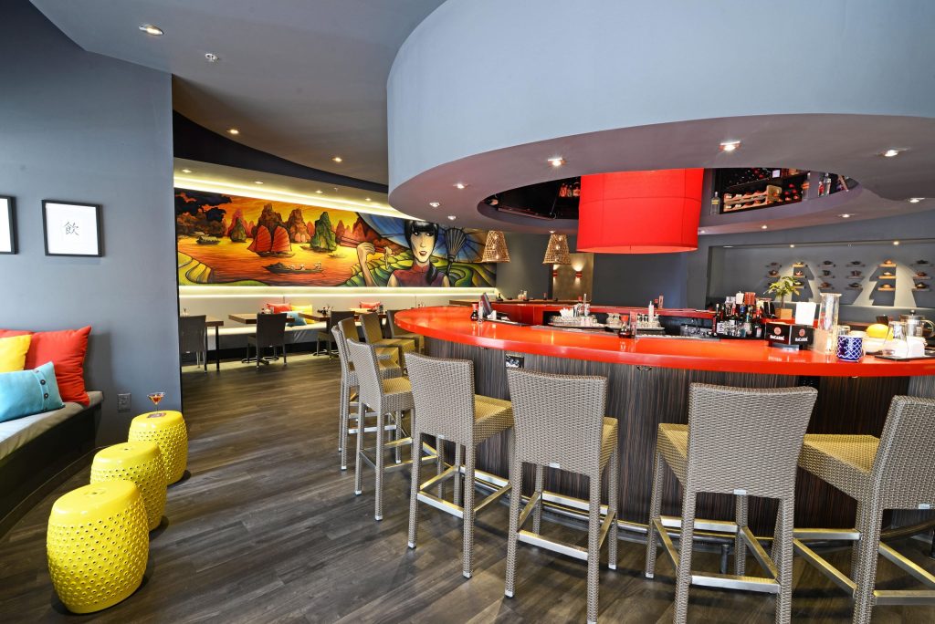
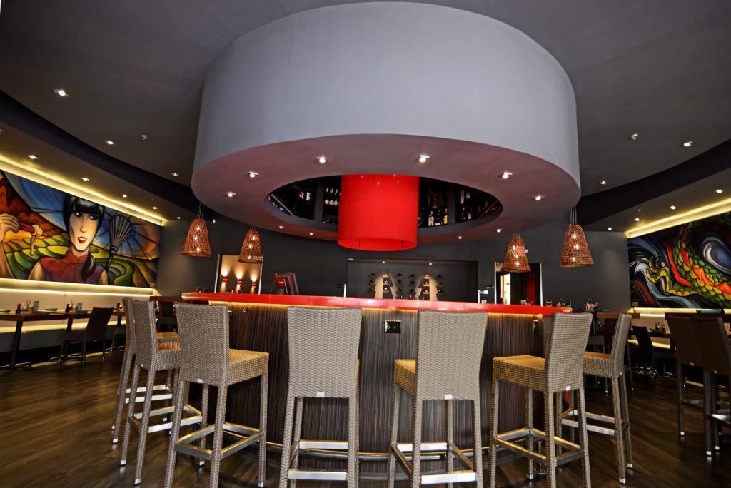
The circular bar in the center of the restaurant is reiterated in an outer ring of arced tables creating a implied outer circle around the bar. After removing the low drop ceiling and raising the ceiling, we needed to intentionally create some lower areas to provide an intimate dining experience. We designed a circular ceiling soffit over the bar, a wider circular ceiling soffit to cover the outer ring of arced tables, as well as, a soffit over each row of tables under the murals.
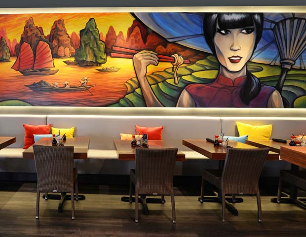
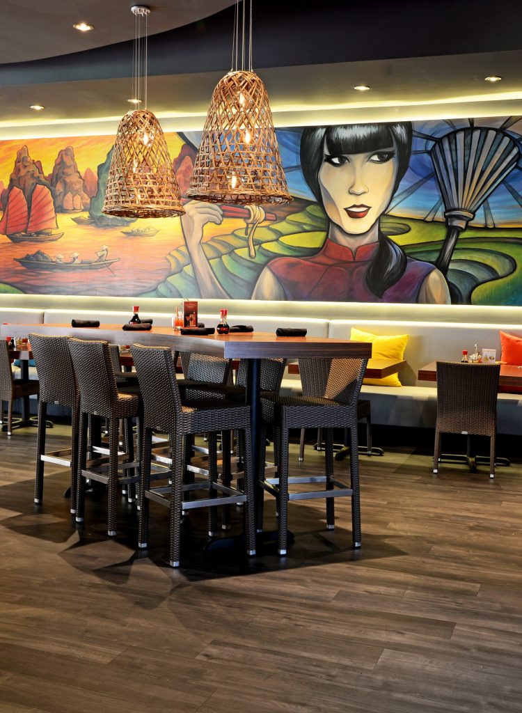
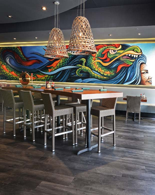
The two murals depict the client’s heritage with the dragon representing good luck in Chinese culture and the Vietnamese mural representing the client’s family’s past in Vietnam making Vietnamese food. This would be an important tie in, as the restaurant would reopen with a new menu featuring Vietnamese items, as well.
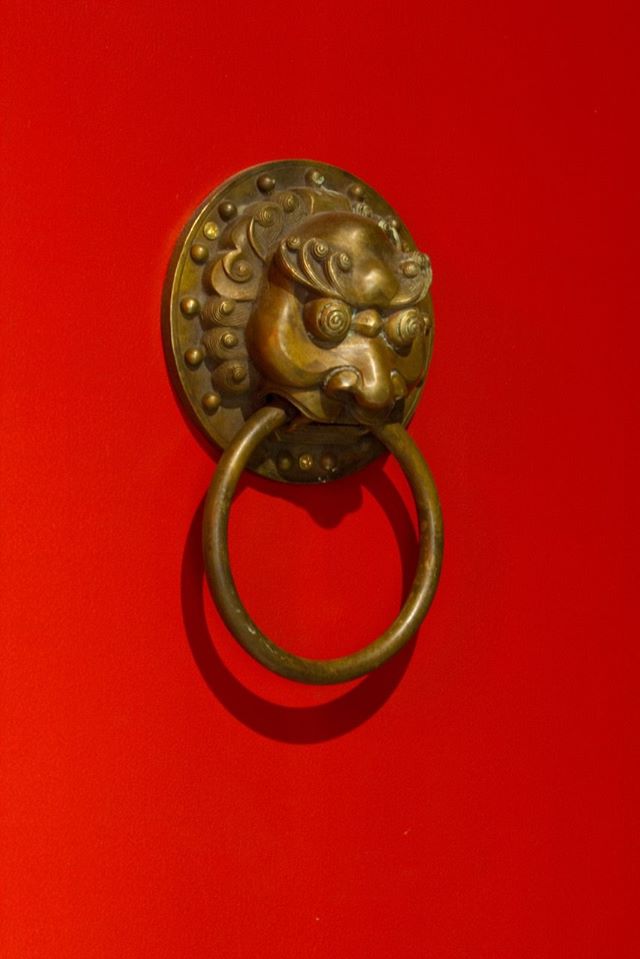
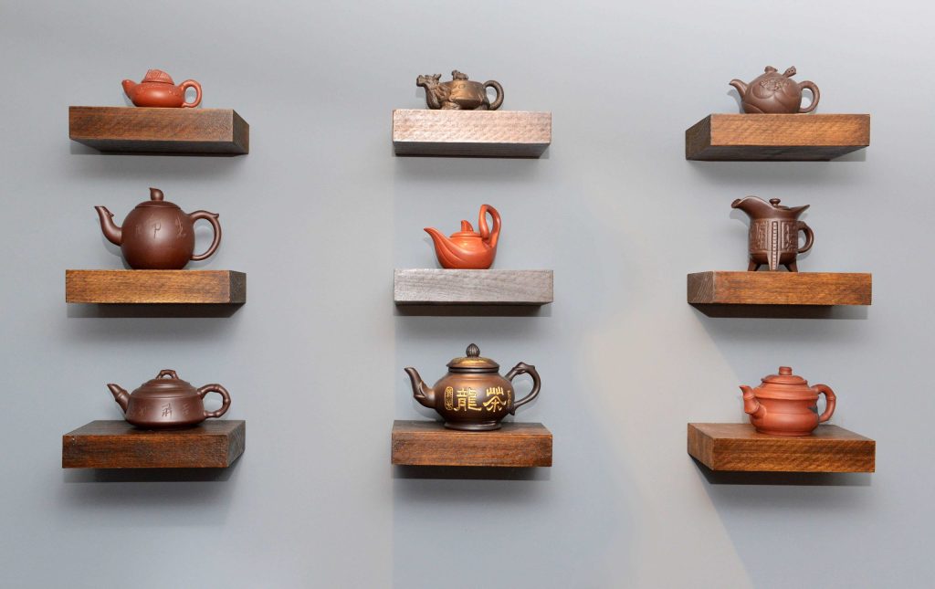
The red light in the center of the circular bar nods to a giant paper lantern, and the basket lights are converted Chinese chicken cages farmers place over chickens to keep them contained. The baskets have a hole in the top to feed the chickens which made the conversion quite simple. The client had a collection of Chinese teapots we displayed in a small dining room on floating shelves and a set Chinese door knockers, like those seen at the Forbidden City, we used on the interior doors in the restaurant. A red bar top was chosen as the good luck color of Chinese culture.
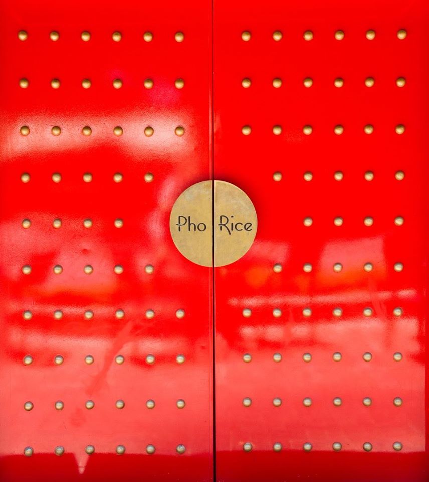
The front doors were designed to look like the Forbidden City in Beijing with a circular door handle, inscribed with their culinary staples, reminiscent of a Chinese wedding cabinet. The exterior facade Art Deco details, not original to the building, were removed, a new skim coat of stucco was added, exterior lighting, signage, new awnings and a menu case.
A new modern logo in the shape of a circle, with references to a highlighted bowl and chopstick completes the transformation and takes the restaurant into the next 20 years.
